A preset sets the colors and radius of every component.
How it works
Components use FLXTheme.default automatically. That default lives in DesignSystem/Theme/FLXThemeEnvironment.swift, so there's nothing to configure.
To use another preset in your whole app, change the default there:
To use it in only part of your app, apply it to a view. Everything inside that view uses it:
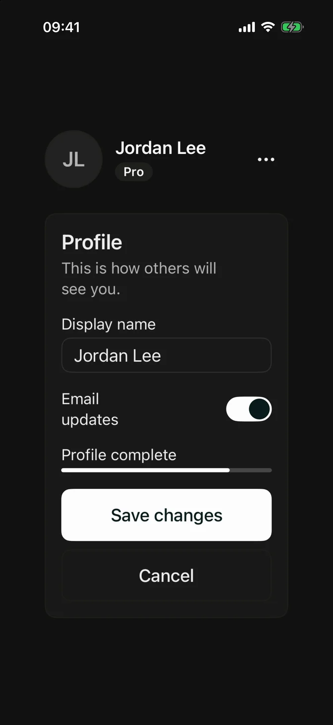
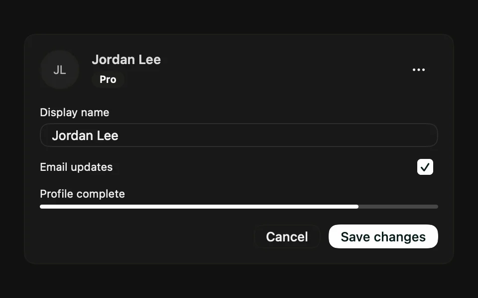
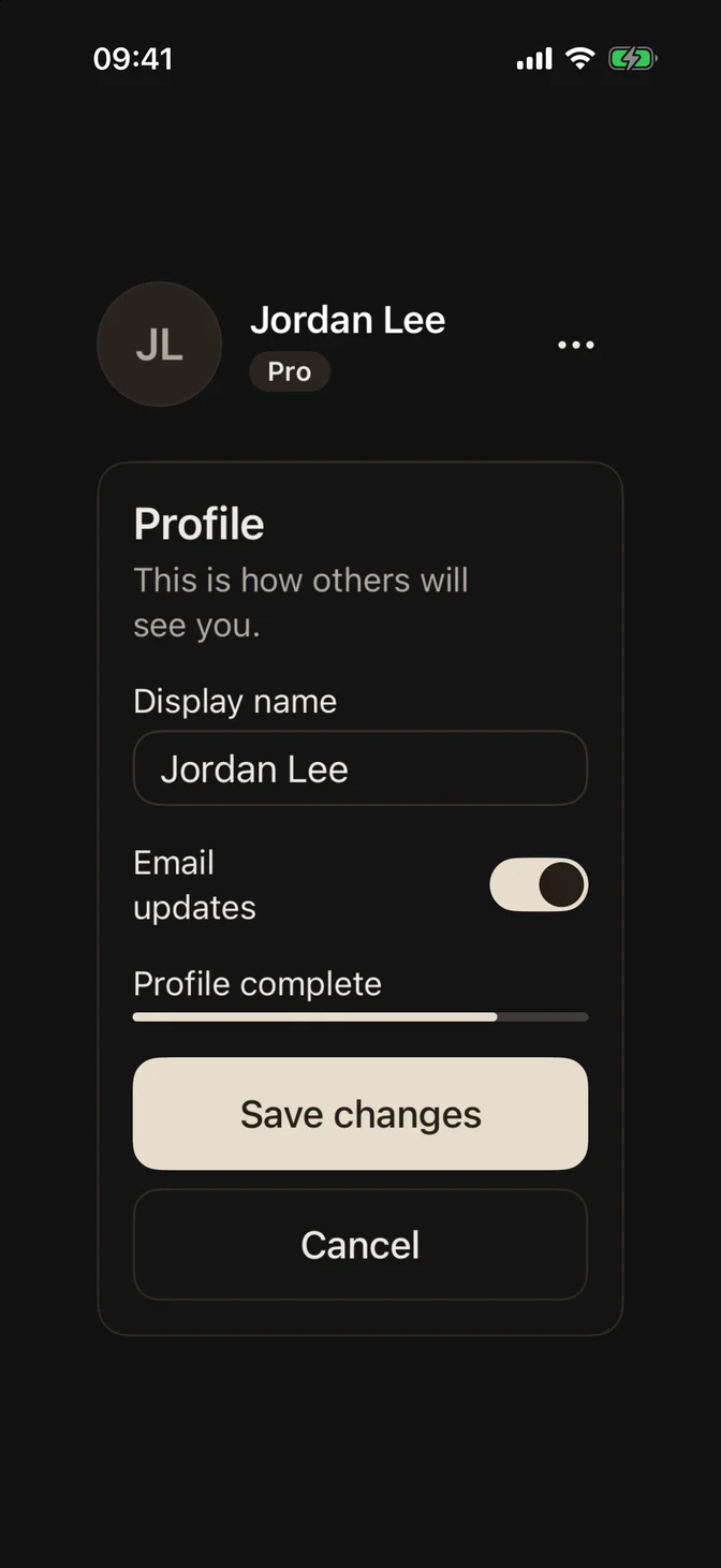
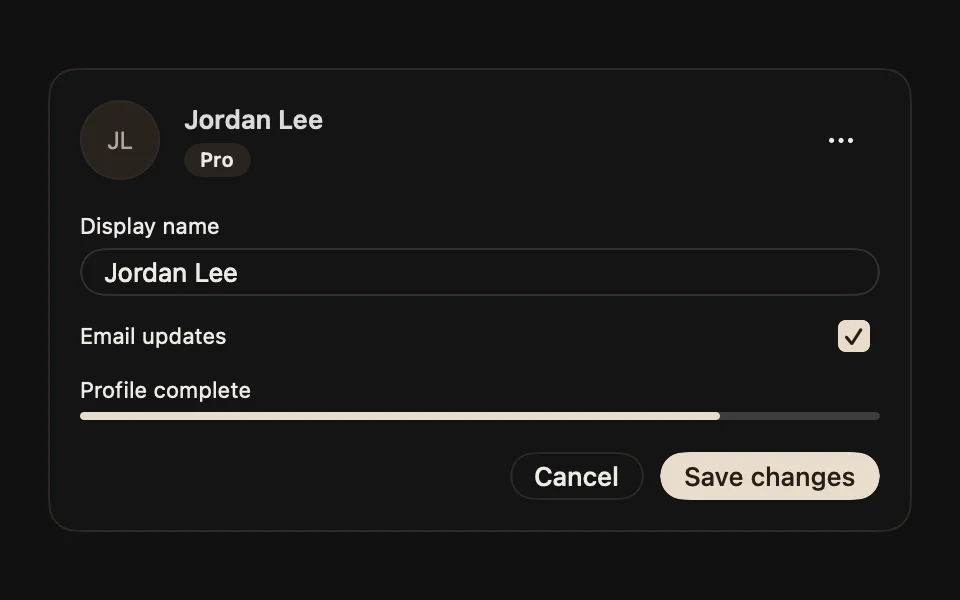
Presets handle light and dark mode on their own.
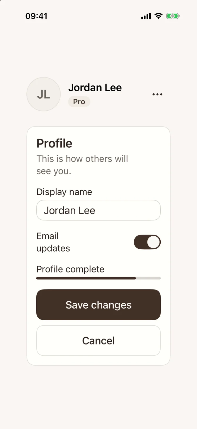
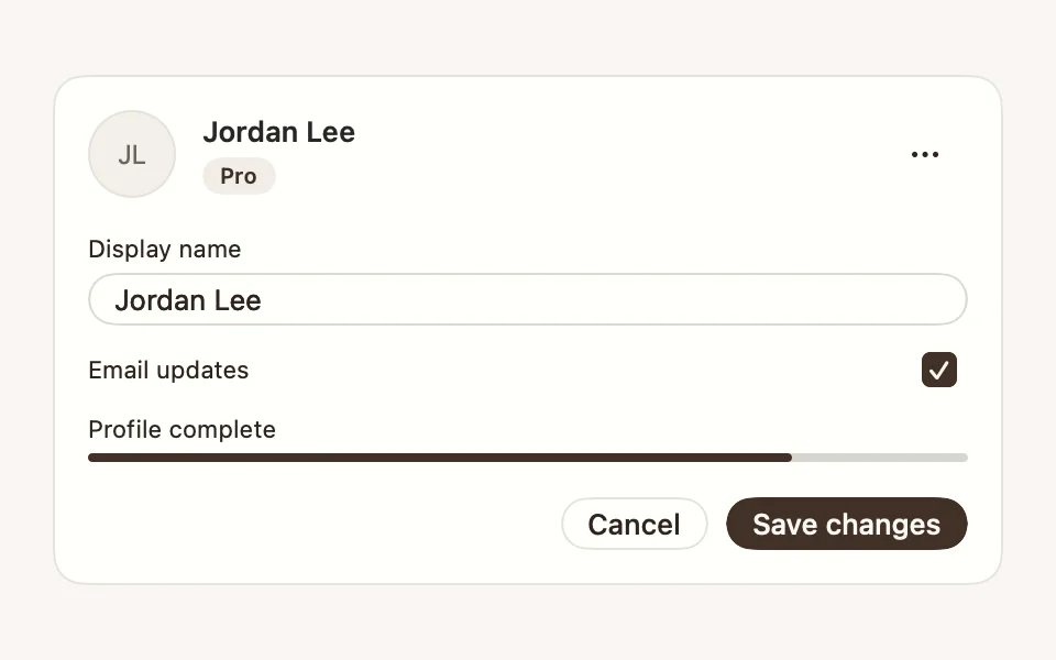
Default
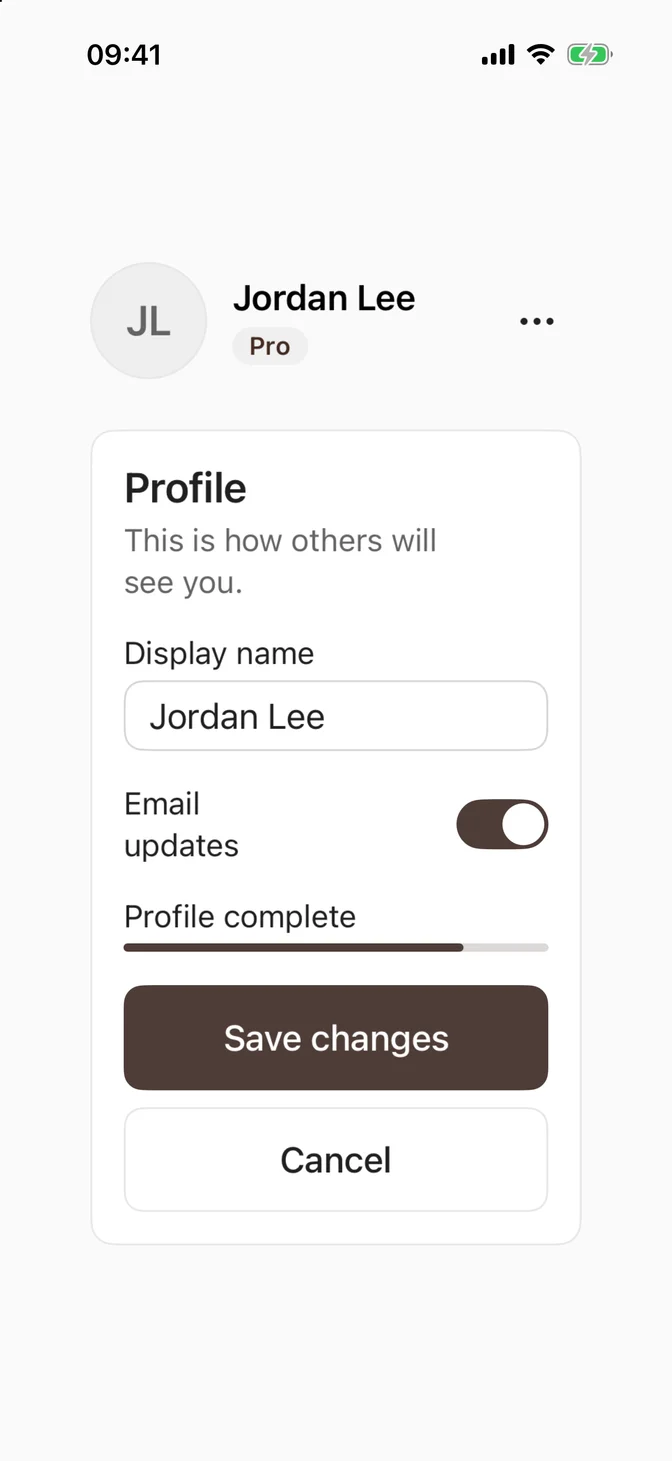
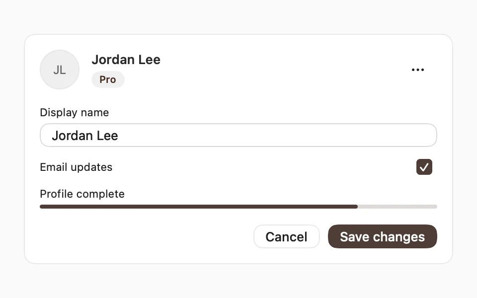
Near-neutral surfaces and a warm charcoal primary. FLXTheme.default comes with the foundation and is active from the start.
Sienna
Cream paper, burnt-earth ink, and a larger base radius.
Create your own
A preset is a FLXTheme value. To change only a few tokens, start from an existing preset:
To set every color yourself, copy DesignSystem/Theme/Presets/FLXTheme+Default.swift, rename the preset, and change its colors and radius.
Then use it like any other preset: