Empty

iOS 16.4+iPadOS 16.4+

Displays an empty state, with an optional icon, title, description, and actions.
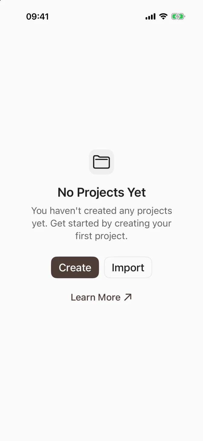
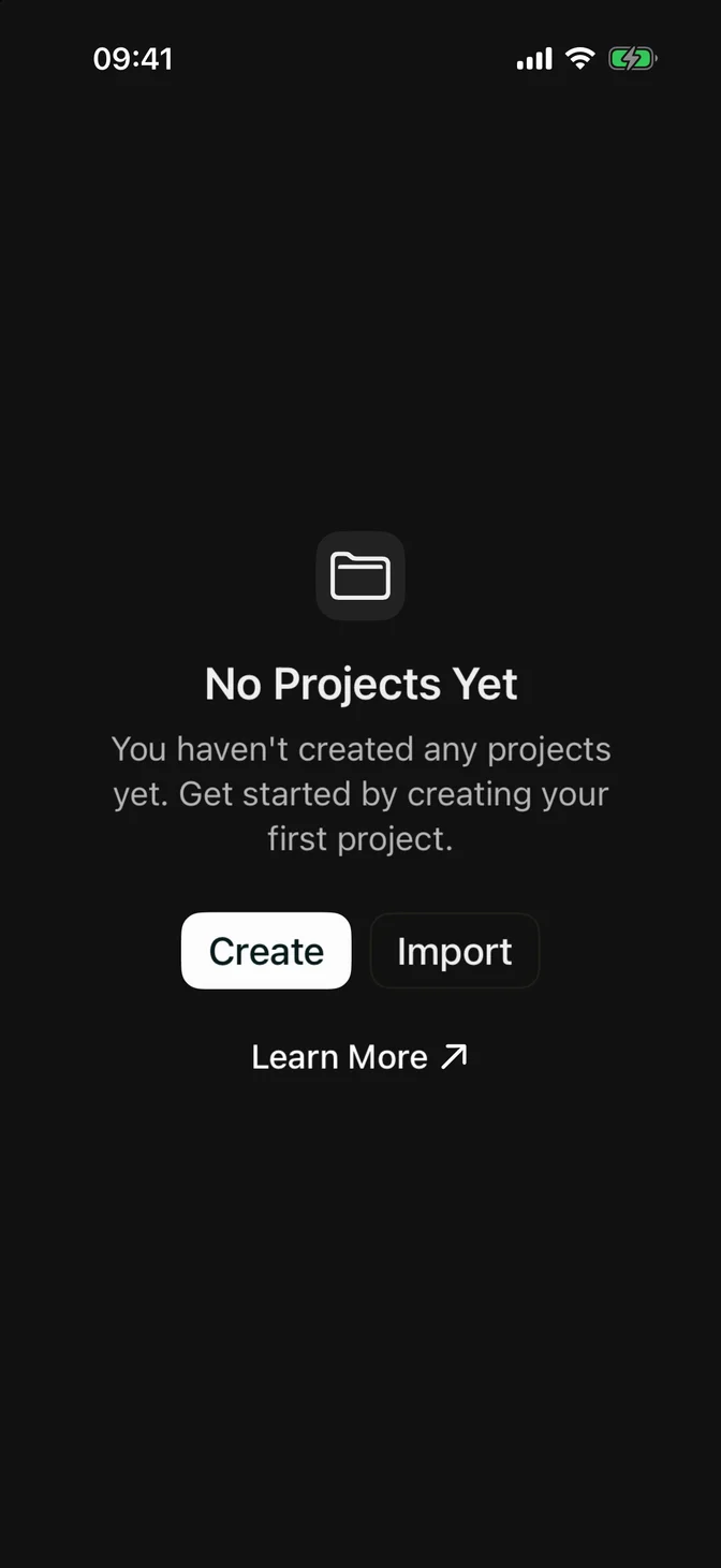
FLXEmpty example
import SwiftUIstruct EmptyUsageExample: View {    var body: some View {        FLXEmpty {            FLXEmptyHeader {                FLXEmptyMedia(variant: .icon) {                    Image(systemName: "folder")                }                FLXEmptyTitle("No Projects Yet")                FLXEmptyDescription("You haven't created any projects yet. Get started by creating your first project.")            }            FLXEmptyContent {                HStack(spacing: FLXSpacing.sm) {                    FLXButton("Create") {}                    FLXButton("Import", variant: .outline) {}                }                FLXButton(variant: .link, action: {}) {                    HStack(spacing: FLXSpacing.xs) {                        Text("Learn More")                        Image(systemName: "arrow.up.right")                    }                }                .controlSize(.small)            }        }    }}

Installation

Requires the design system foundation (tokens and theme).

pnpm dlx shadcn@latest add @swiftui-flx/ios-empty

Usage

FLXEmpty {    FLXEmptyHeader {        FLXEmptyMedia(variant: .icon) {            Image(systemName: "tray")        }        FLXEmptyTitle("No Data")        FLXEmptyDescription("No data found.")    }    FLXEmptyContent {        FLXButton("Add Data") {}    }}

FLXEmpty fills the space it's given and centers its content, so it works as the whole screen or as an overlay on an empty list:

List(projects) { project in    Text(project.name)}.overlay {    if projects.isEmpty {        FLXEmpty {            FLXEmptyHeader {                FLXEmptyTitle("No Projects Yet")            }        }    }}

For search with no results on iOS 17 and later, SwiftUI's ContentUnavailableView.search already provides the system empty state.

Composition

Use the following composition to build an empty state:

FLXEmpty├── FLXEmptyHeader│   ├── FLXEmptyMedia│   ├── FLXEmptyTitle│   └── FLXEmptyDescription└── FLXEmptyContent

All sections are optional. FLXEmptyHeader and FLXEmptyContent are centered VStacks with a readable maximum width. VoiceOver reads the header as one element, with the title as a heading, and skips the media.

Media

FLXEmptyMedia has two variants, set via variant:. .icon wraps an SF Symbol in a rounded muted square; .regular renders the content as-is, for an avatar or an image:

FLXEmpty with an avatar
FLXEmpty {  FLXEmptyHeader {      FLXEmptyMedia {          FLXAvatar(size: .large) {              FLXAvatarImage(url: URL(string: "https://github.com/shadcn.png"))          }      }      FLXEmptyTitle("User Offline")      FLXEmptyDescription("This user is currently offline. You can leave a message to notify them or try again later.")  }  FLXEmptyContent {      FLXButton("Leave Message") {}          .controlSize(.small)  }}

Custom styling

Each piece has its own FLX protocol: FLXEmptyStyle, FLXEmptyMediaStyle, FLXEmptyTitleStyle, and FLXEmptyDescriptionStyle. Override any of them for a subtree via the matching modifier, e.g. .flxEmptyStyle(_:) for a dashed outline:
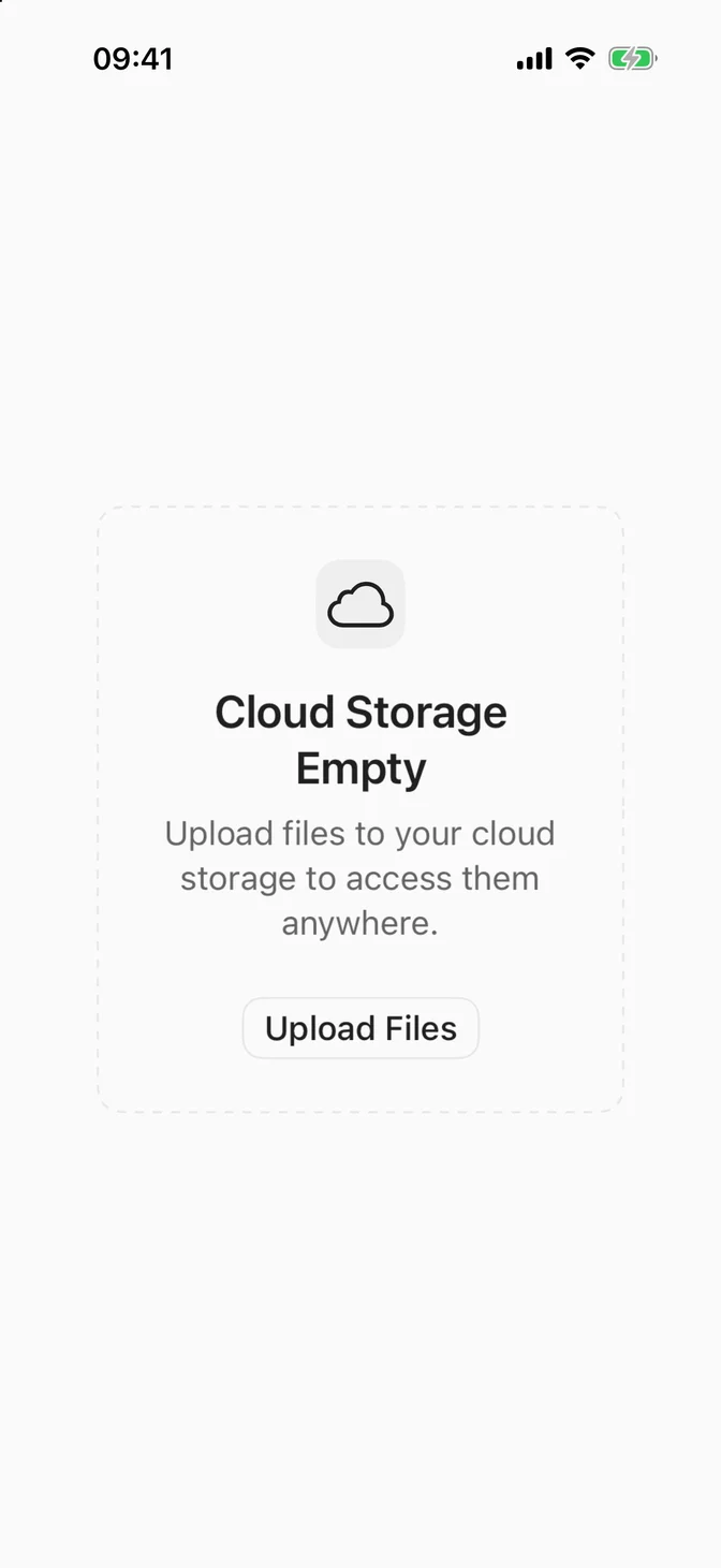
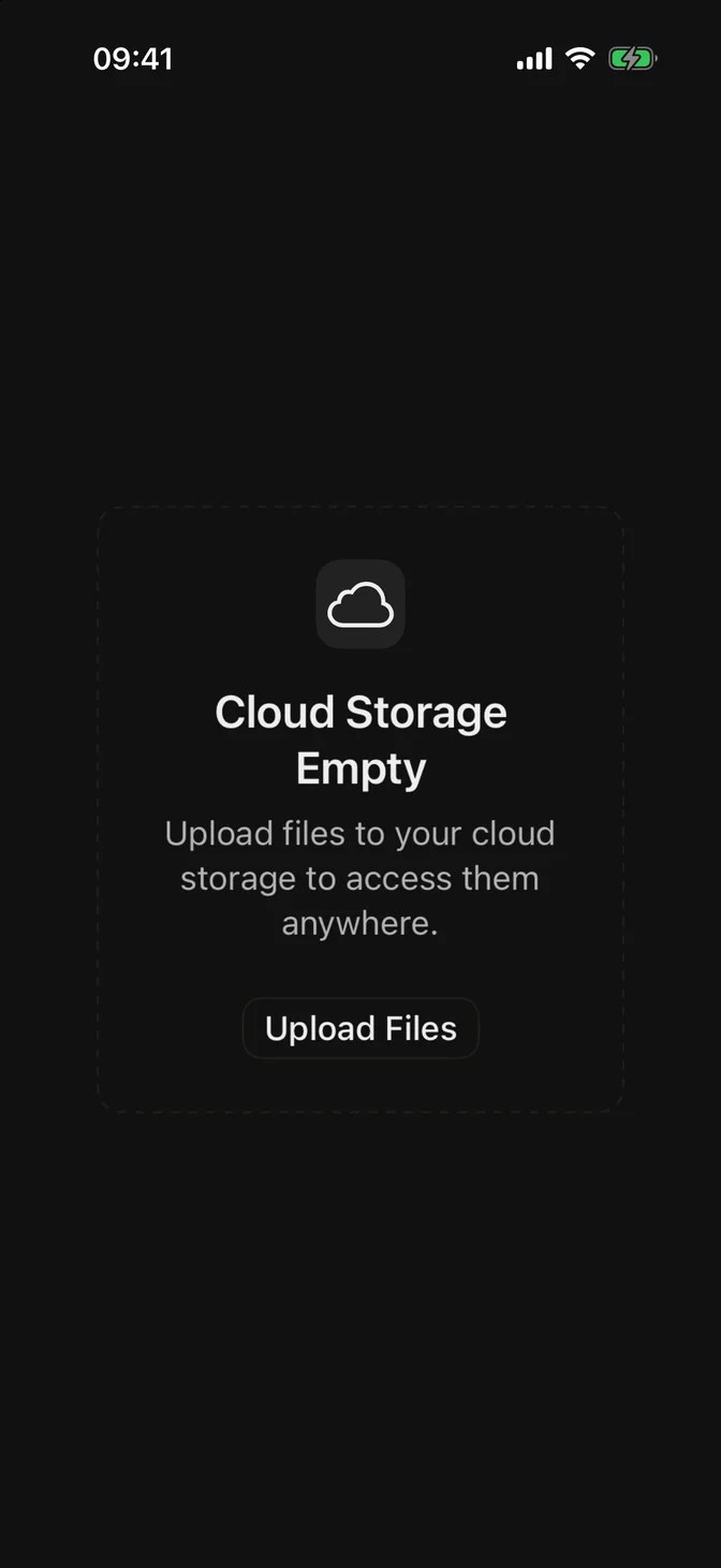
FLXEmpty custom styling
struct FLXOutlineEmptyStyle: FLXEmptyStyle {  func makeBody(configuration: Configuration) -> some View {      FLXOutlineEmptyStyleBody(configuration: configuration)  }}private struct FLXOutlineEmptyStyleBody: View {  @Environment(\.flxTheme) private var theme  let configuration: FLXEmptyStyleConfiguration  var body: some View {      VStack(spacing: FLXSpacing.xl) {          configuration.content      }      .padding(FLXSpacing.xl)      .frame(maxWidth: .infinity)      .overlay(          RoundedRectangle(cornerRadius: theme.radius.lg)              .strokeBorder(theme.colors.border, style: StrokeStyle(lineWidth: FLXBorderWidth.thin, dash: [4]))      )  }}FLXEmpty {  FLXEmptyHeader {      FLXEmptyMedia(variant: .icon) {          Image(systemName: "icloud")      }      FLXEmptyTitle("Cloud Storage Empty")      FLXEmptyDescription("Upload files to your cloud storage to access them anywhere.")  }  FLXEmptyContent {      FLXButton("Upload Files", variant: .outline) {}          .controlSize(.small)  }}.flxEmptyStyle(FLXOutlineEmptyStyle())

API Reference

FLXEmpty

init(@ViewBuilder content: @escaping () -> Content)

FLXEmptyHeader

init(@ViewBuilder content: @escaping () -> Content)

FLXEmptyMedia

init(    variant: FLXEmptyMediaVariant = .regular,    @ViewBuilder content: @escaping () -> Content)

FLXEmptyTitle

init(_ titleKey: LocalizedStringKey)init(_ titleResource: LocalizedStringResource)init<S: StringProtocol>(_ title: S)

FLXEmptyDescription

init(_ textKey: LocalizedStringKey)init(_ textResource: LocalizedStringResource)init<S: StringProtocol>(_ text: S)

FLXEmptyContent

init(@ViewBuilder content: @escaping () -> Content)

Media variants

CaseDescription
regularRenders the content as-is, with no extra styling.
iconRounded, muted square for an SF Symbol.