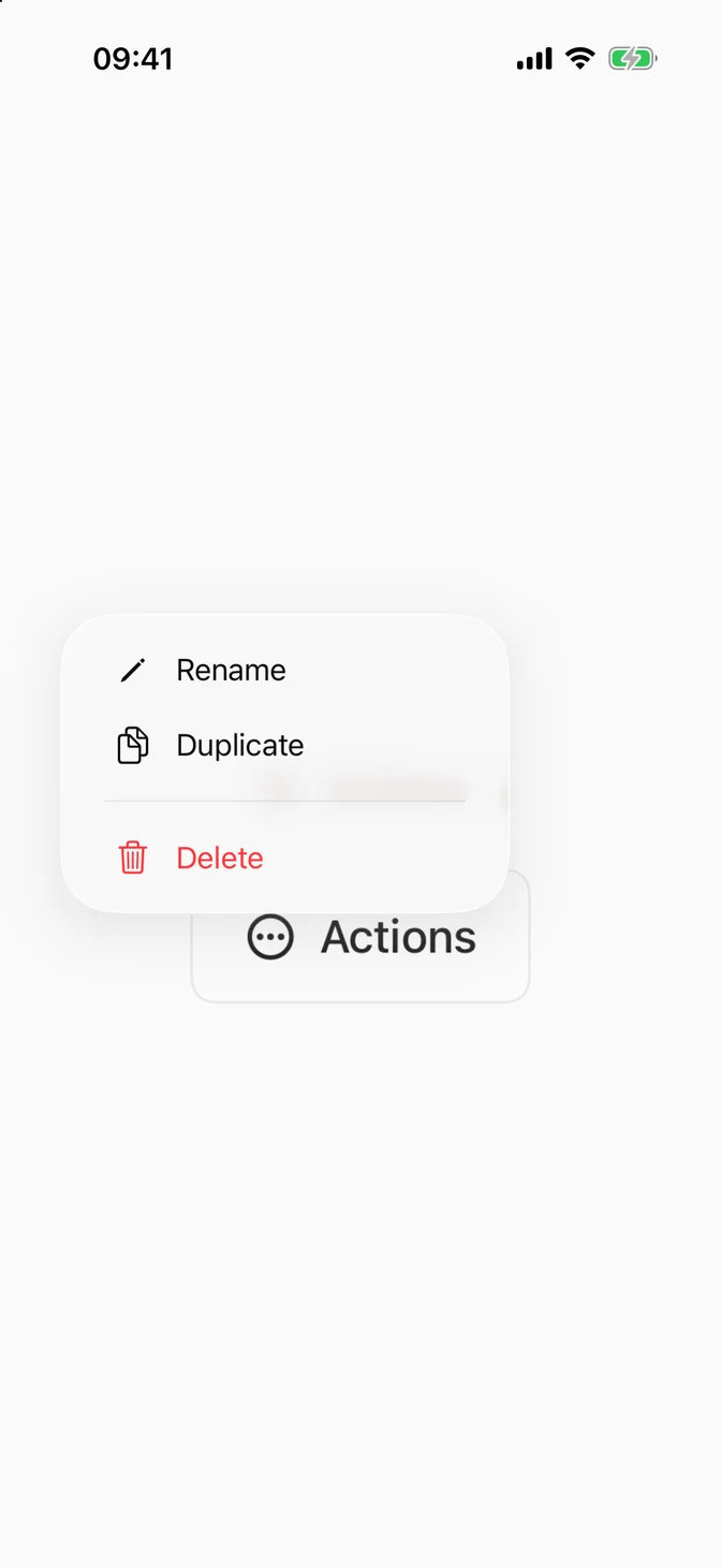
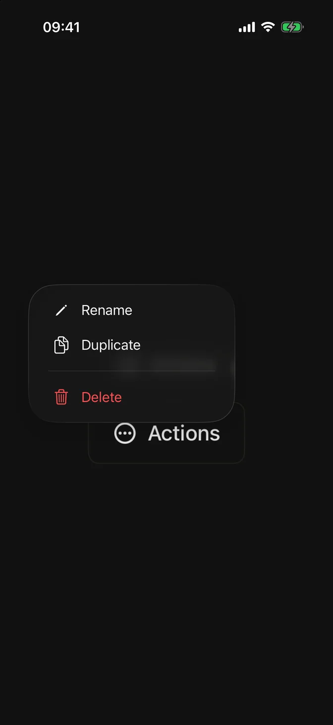
Displays a list of actions or options revealed from a button or custom trigger.
Installation
Requires the design system foundation (tokens and theme), plus FLXButton.
Usage
Content
FLXMenu wraps the native Menu, so the system renders its content. Build it from Button, Divider, Section, a nested Menu for a submenu, or Toggle for options that shouldn't dismiss the menu.
Custom label triggers
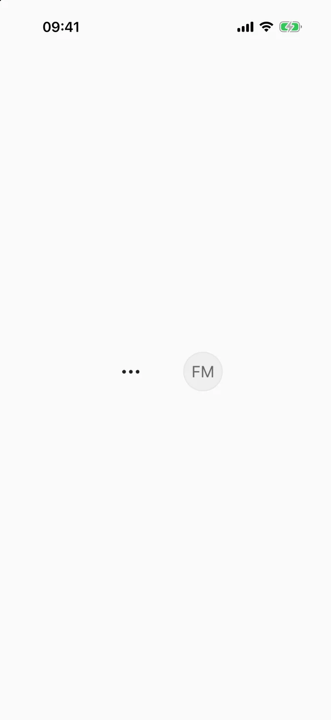
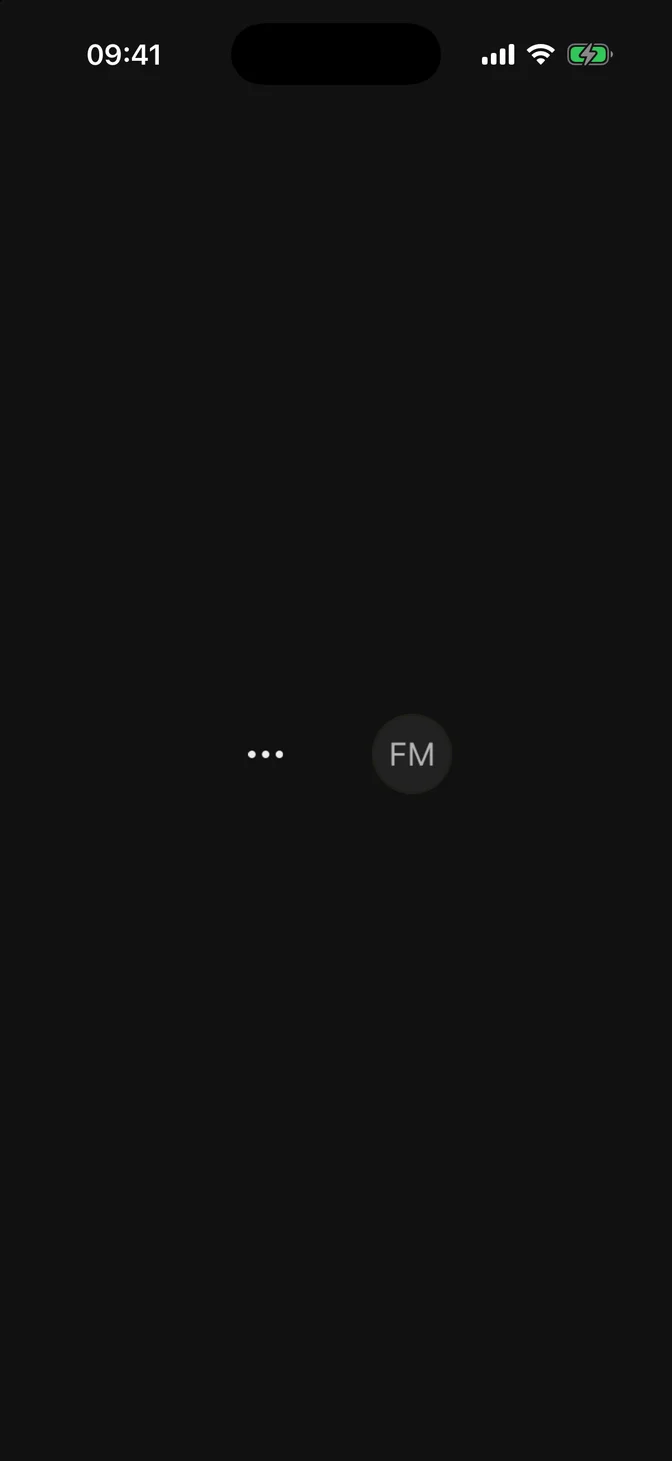
Use the content/label initializer for an icon-only trigger or a custom trigger like an avatar. No FLXButtonStyle is applied, so style the label yourself:
Variants
Five variants, set via variant:. Defaults to .secondary and styles the trigger like FLXButton.
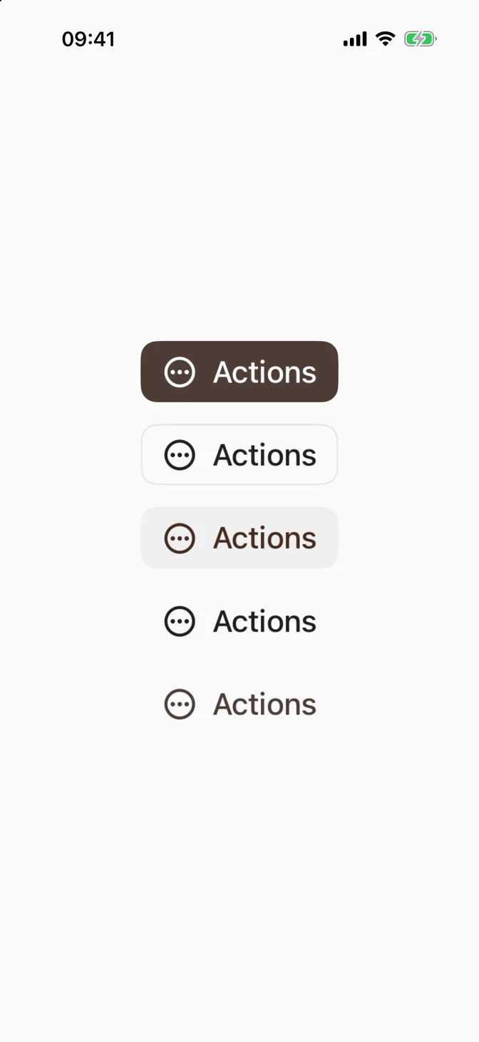
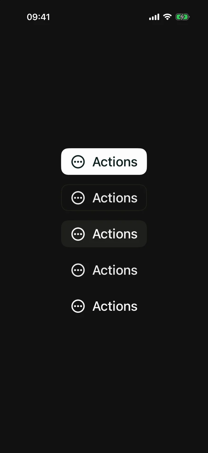
Sizes
Set via .controlSize(_:), like native controls.
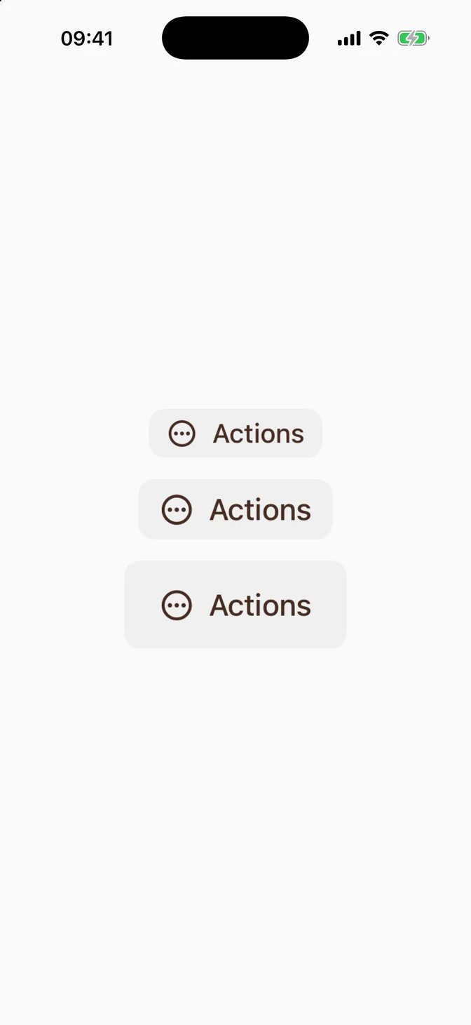
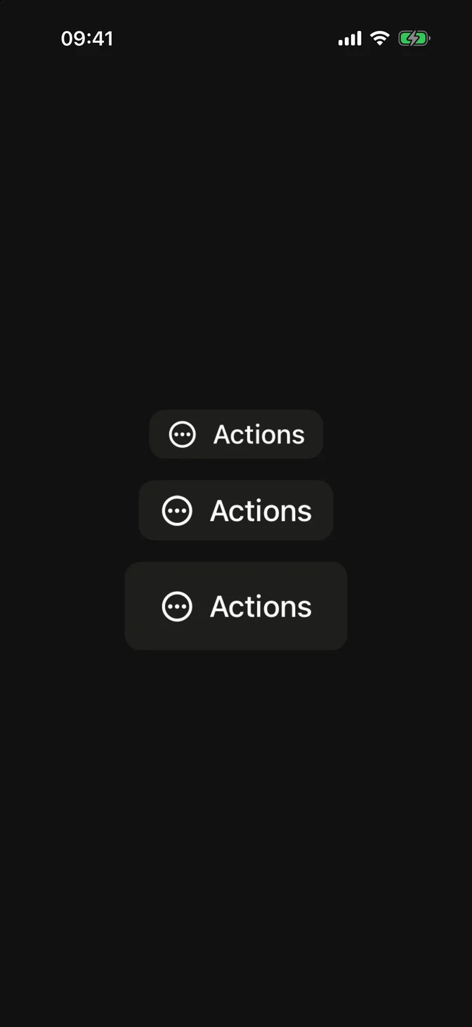
For an icon-only trigger, use custom label triggers.
Custom styling
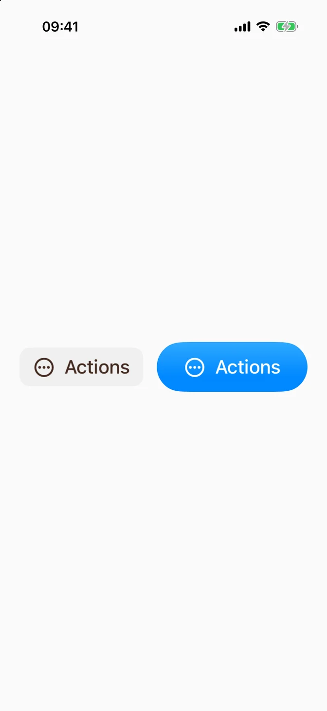
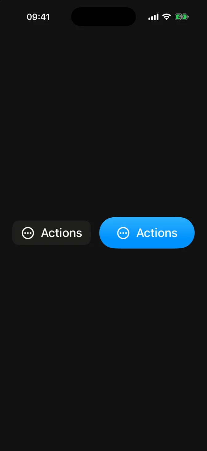
There's no FLXMenuStyle: MenuStyle doesn't expose the menu's content. The trigger uses FLXButtonStyle and accepts the same .flxButtonStyle(_:) override as FLXButton:
API Reference
FLXMenu
Variants
For more information about FLXMenu props, see the Apple documentation.