iOS 16.4+iPadOS 16.4+
Displays a switch for an on/off value.
Installation
Requires the design system foundation (tokens and theme).
Usage
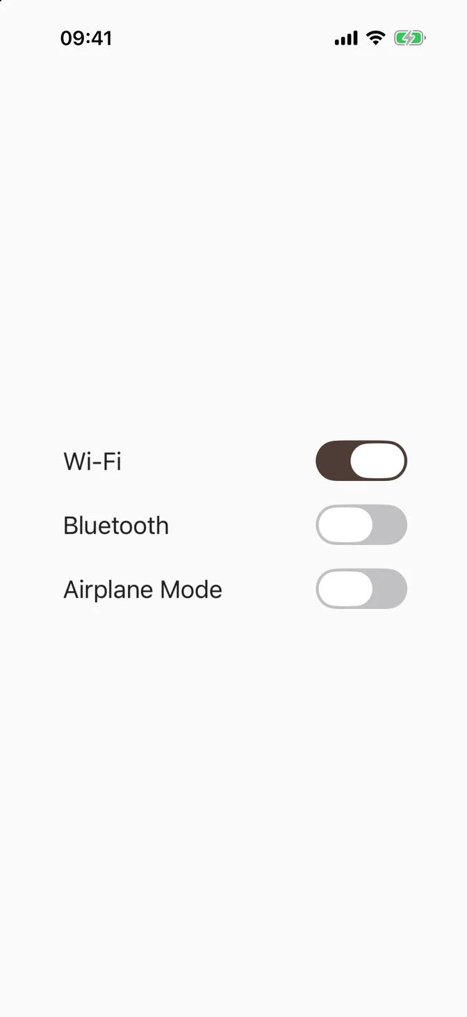
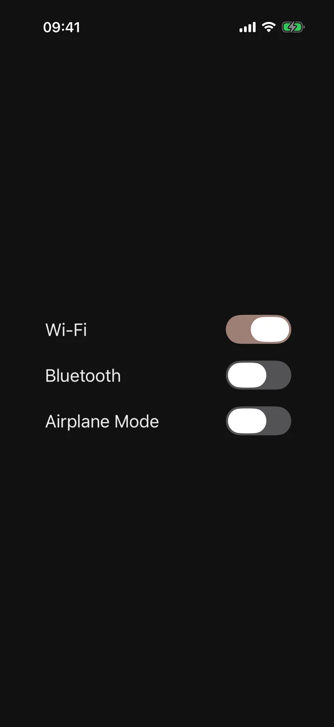
FLXToggle is always controlled via isOn. It renders SwiftUI's native switch. The track uses the theme's light-mode primary in both appearances, because the native thumb is always white.
Custom styling
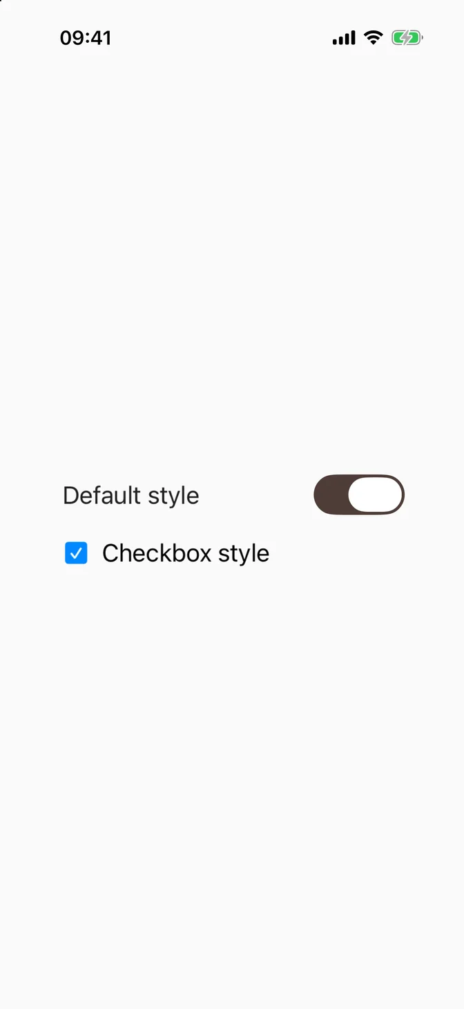
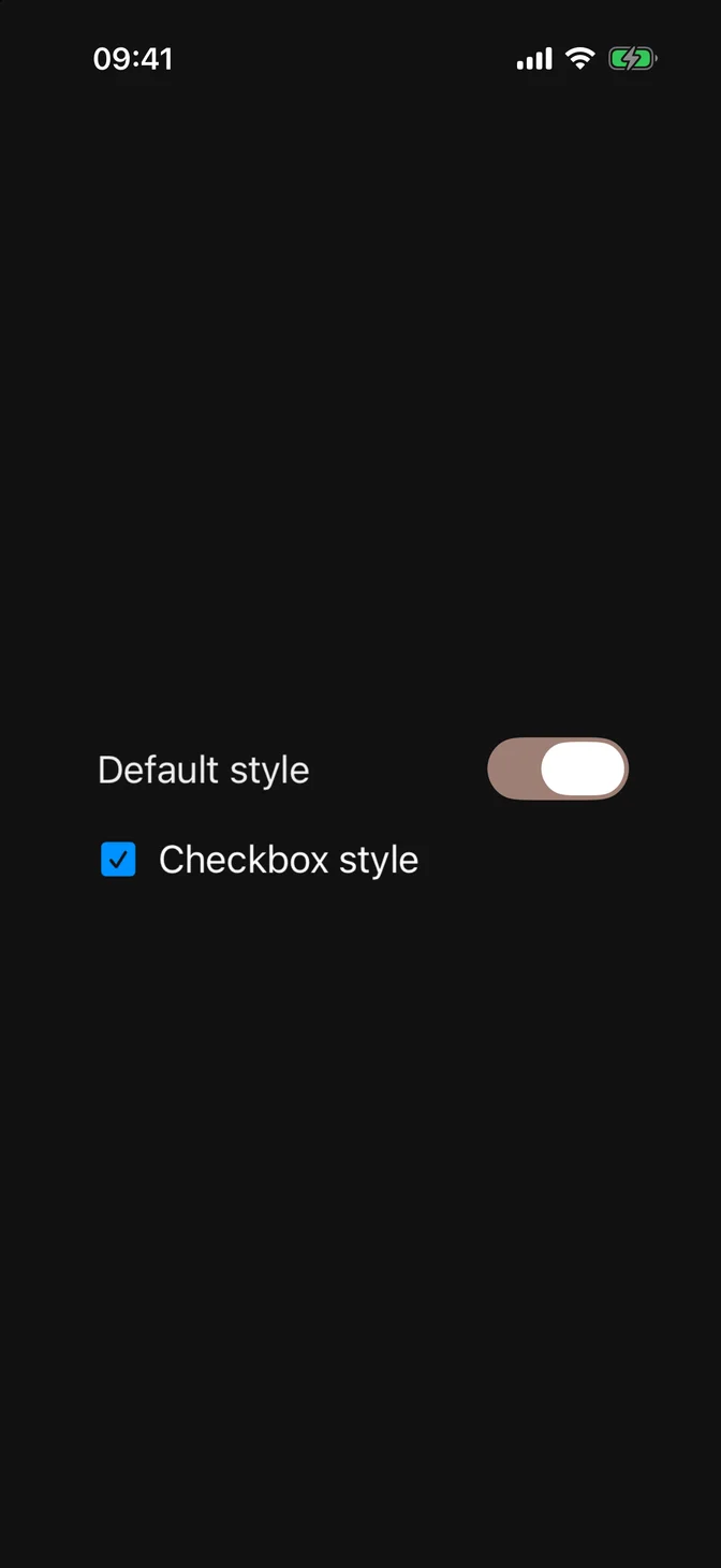
FLXToggleStyle conforms to SwiftUI's native ToggleStyle. Override rendering for a subtree with any ToggleStyle via .flxToggleStyle(_:):
API Reference
FLXToggle
For more information about FLXToggle props, see the Apple documentation.
Changelog
- October 2026 - Native Guides and Tint: Reads the theme's new tint color. Update the foundation before adding this version.