iOS 16.4+iPadOS 16.4+
Triggers an action or event, such as submitting a form.
Installation
Requires the design system foundation (tokens and theme).
Usage
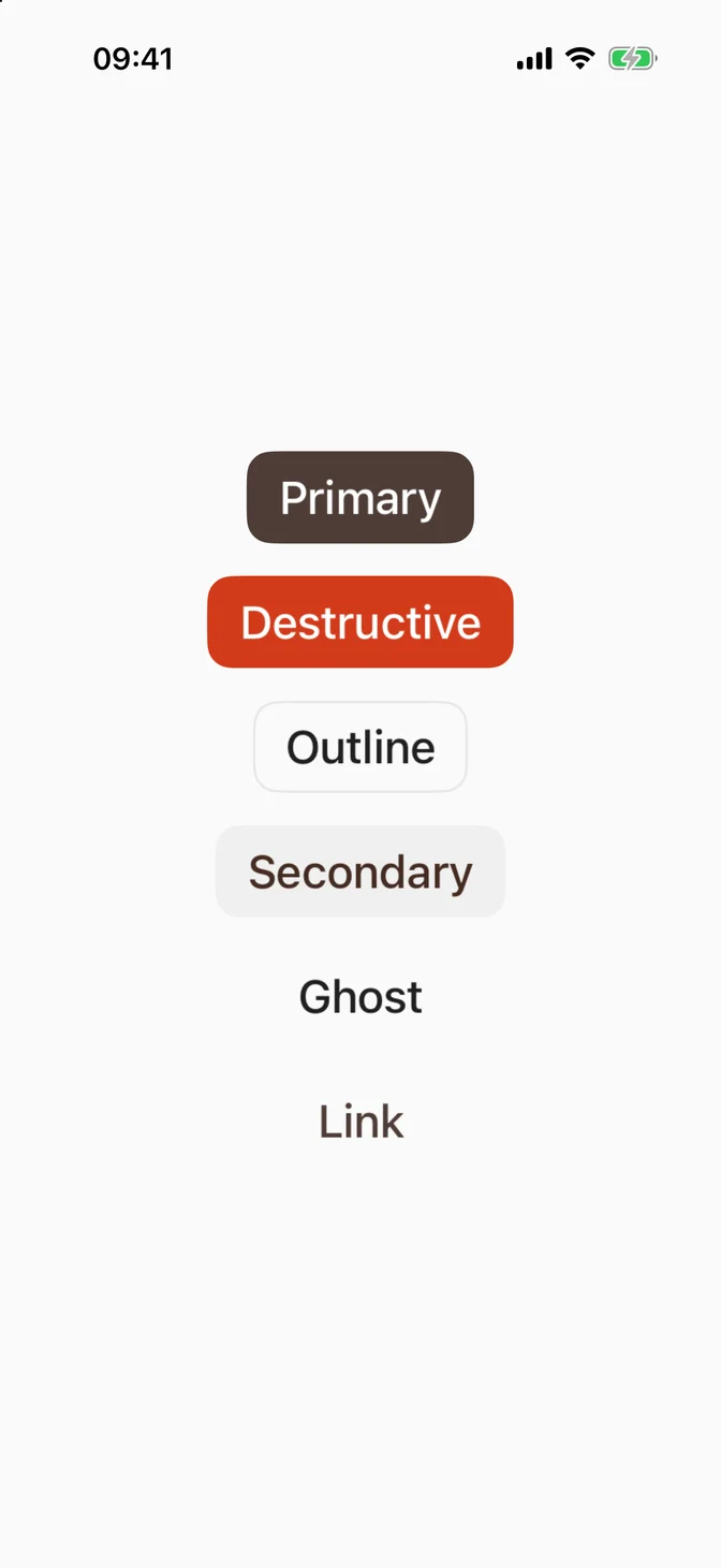
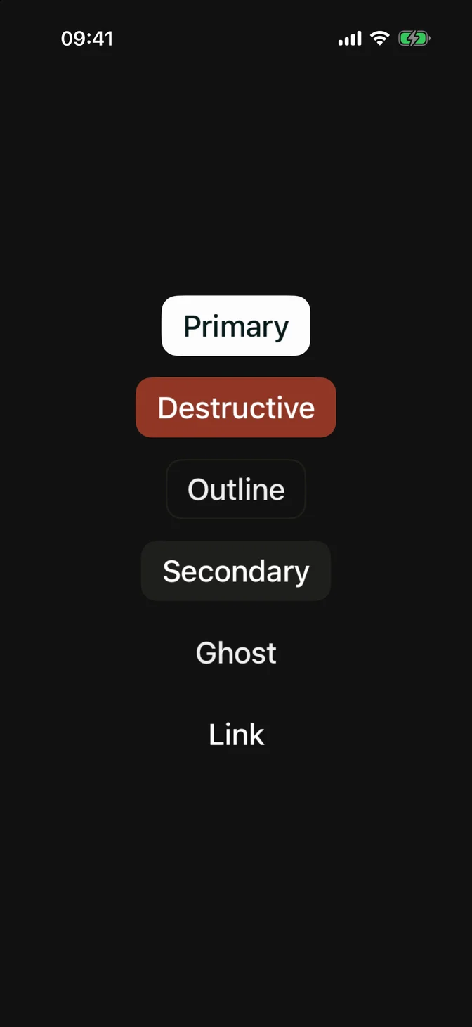
Variants
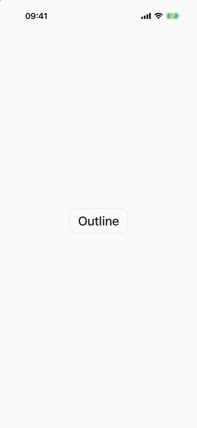
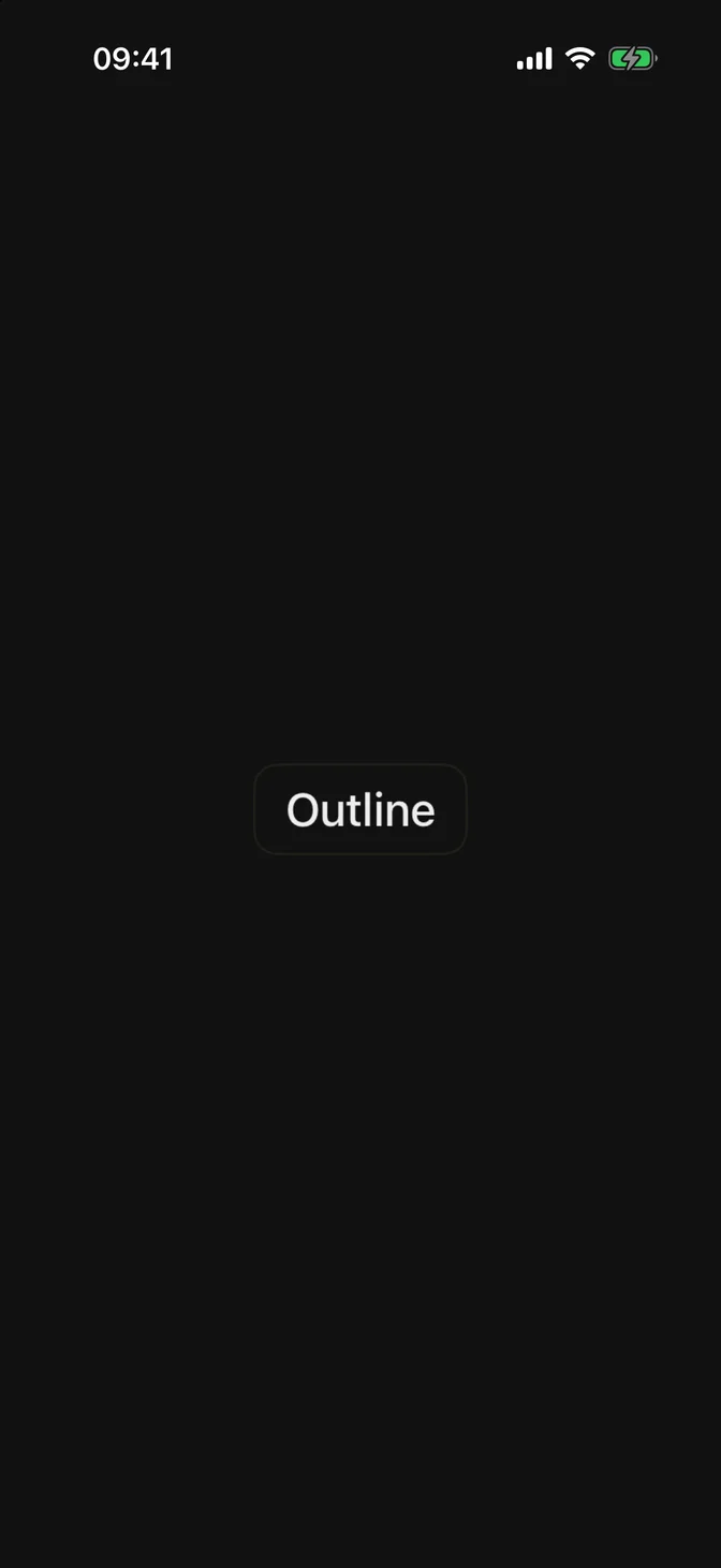
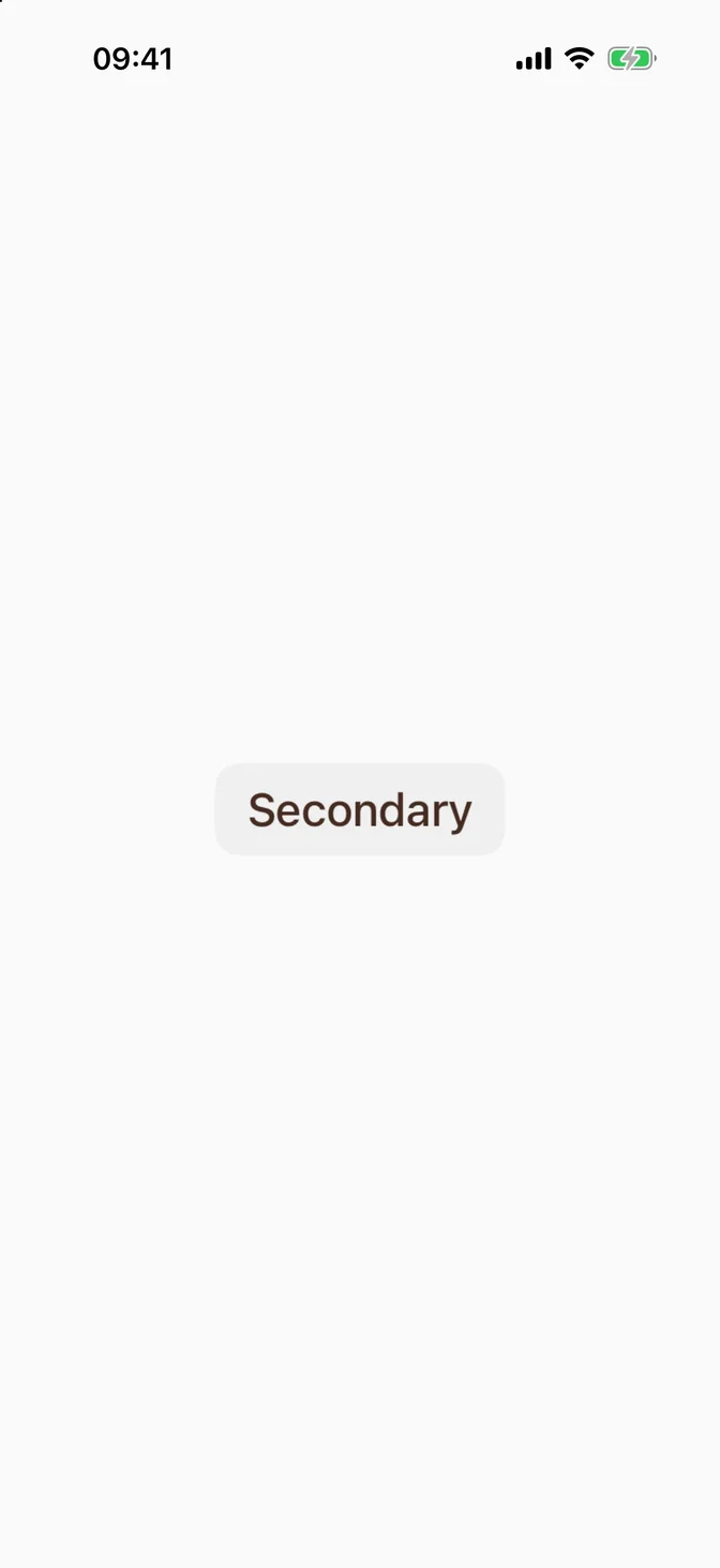
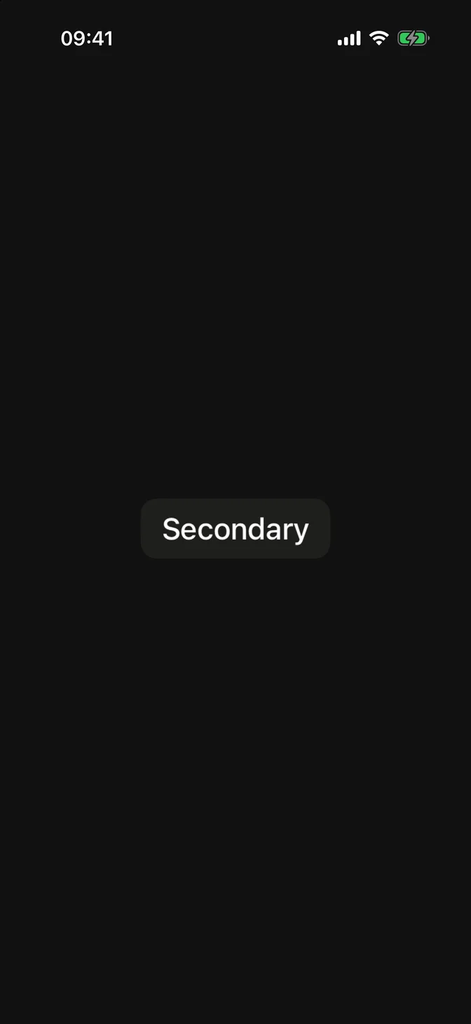
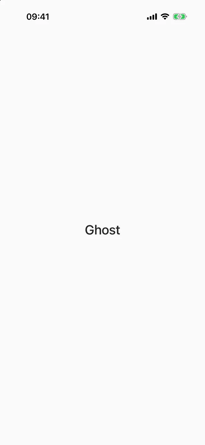
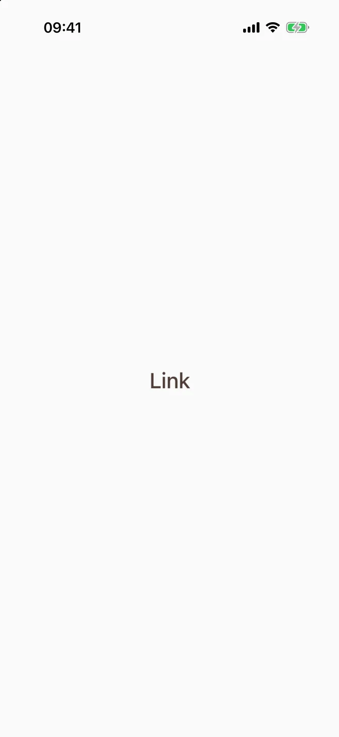
Five variants, set via variant:.
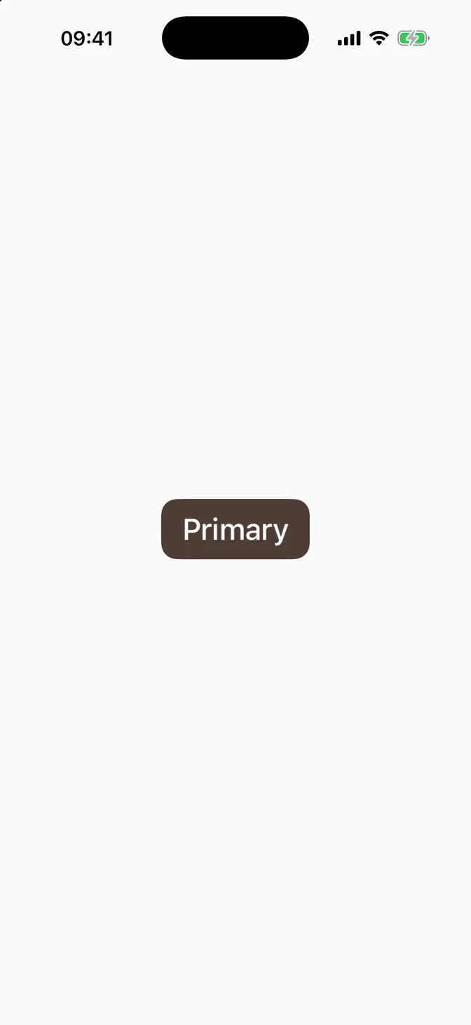
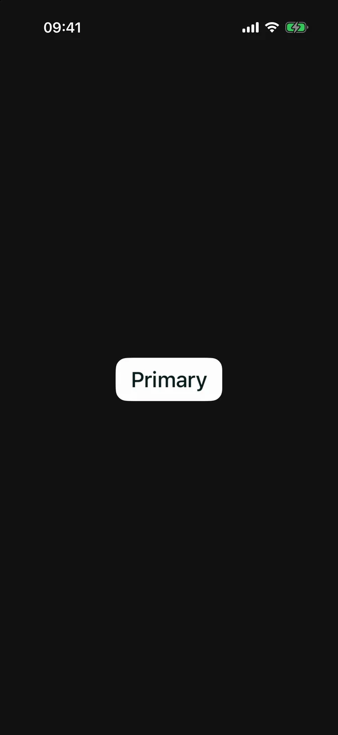
Primary
Outline
Secondary
Ghost

Link

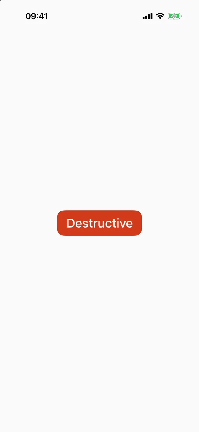
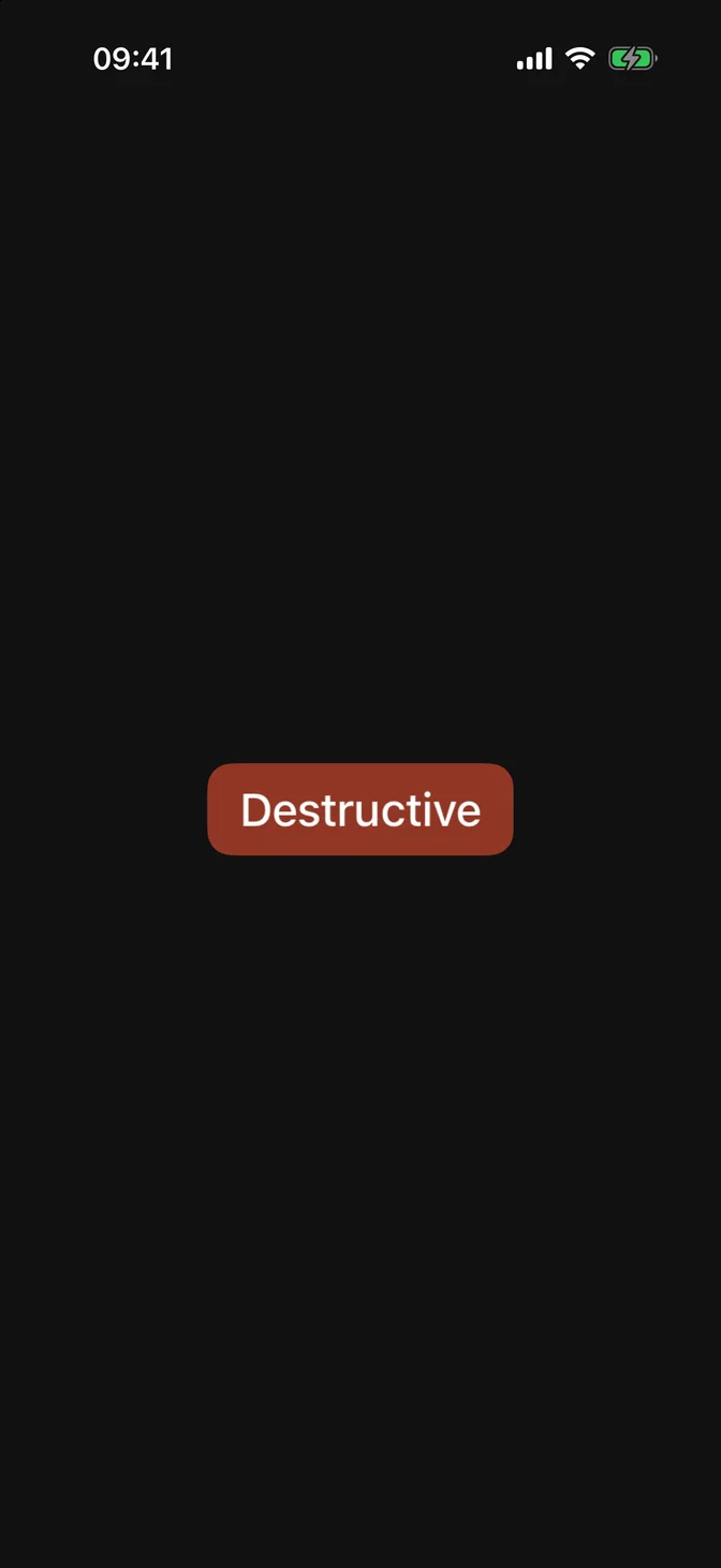
Destructive
Set via role:, like the native Button.
Sizes
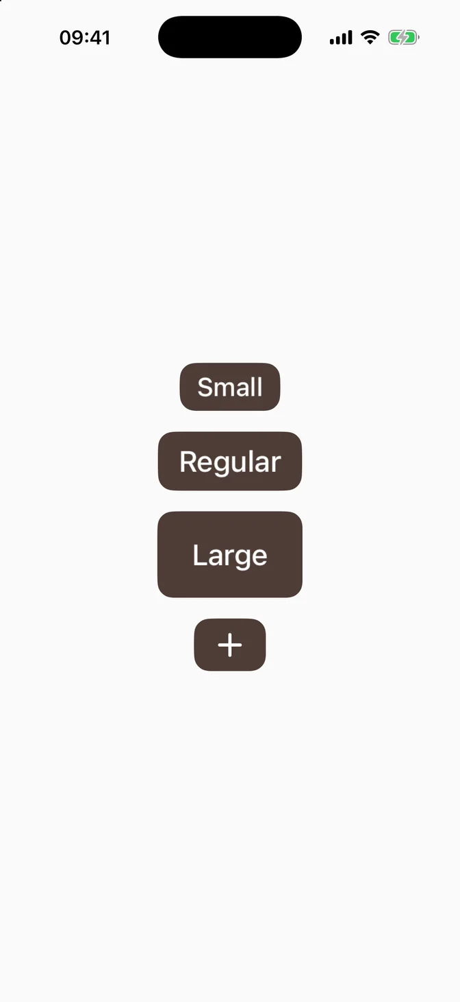
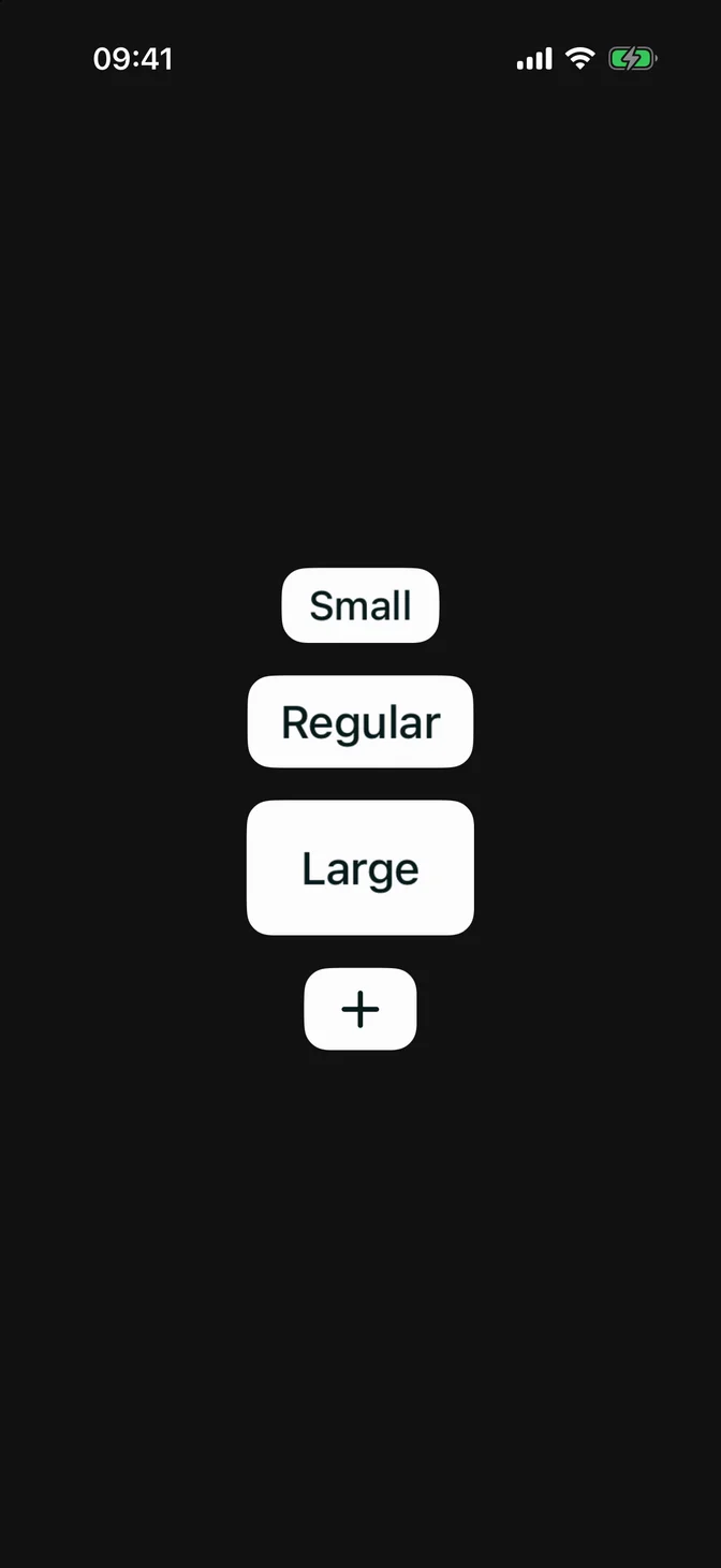
Set via .controlSize(_:), like native controls. For an icon-only button, use .labelStyle(.iconOnly).
Custom styling
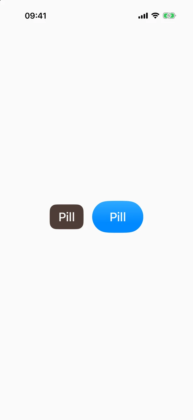
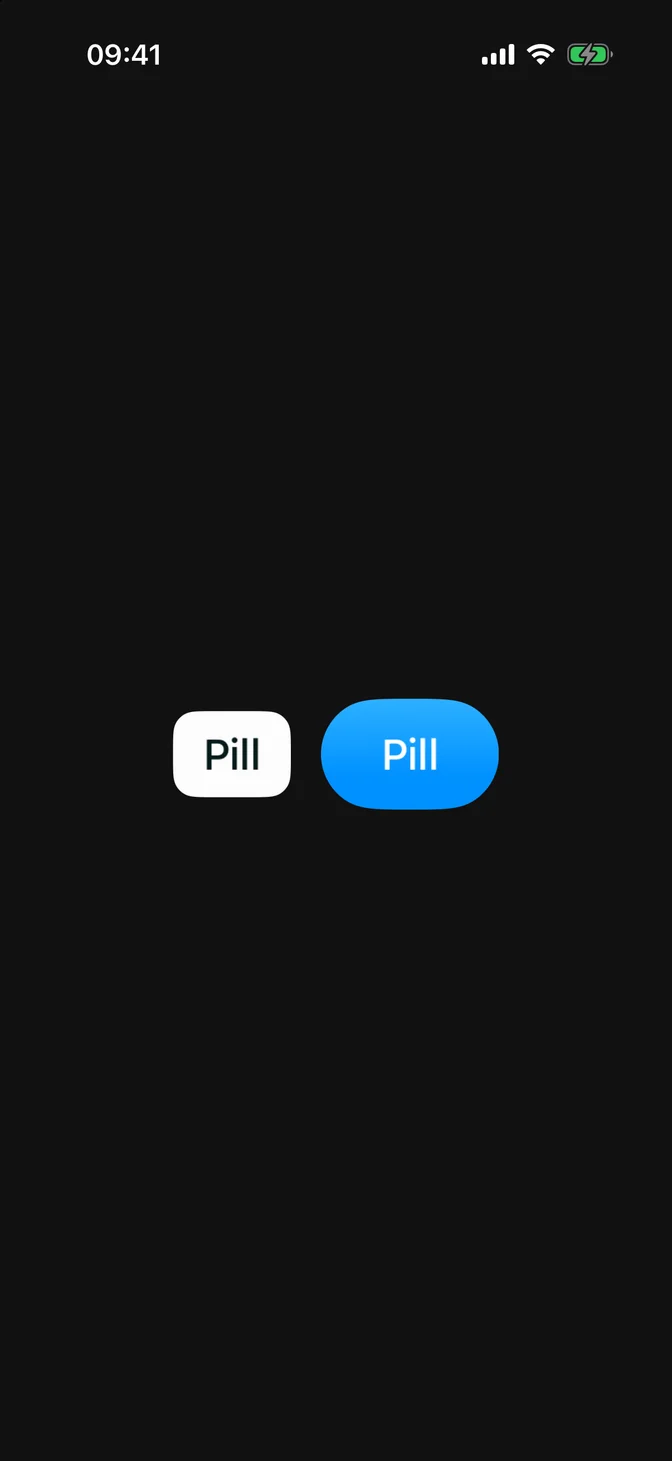
FLXButtonStyle conforms to SwiftUI's native ButtonStyle. Override rendering for a subtree with any ButtonStyle via .flxButtonStyle(_:):
API Reference
FLXButton
Variants
For more information about FLXButton props, see the Apple documentation.