Toast

iOS 16.4+iPadOS 16.4+Not available on macOS

Shows a brief message about an action the person just took.
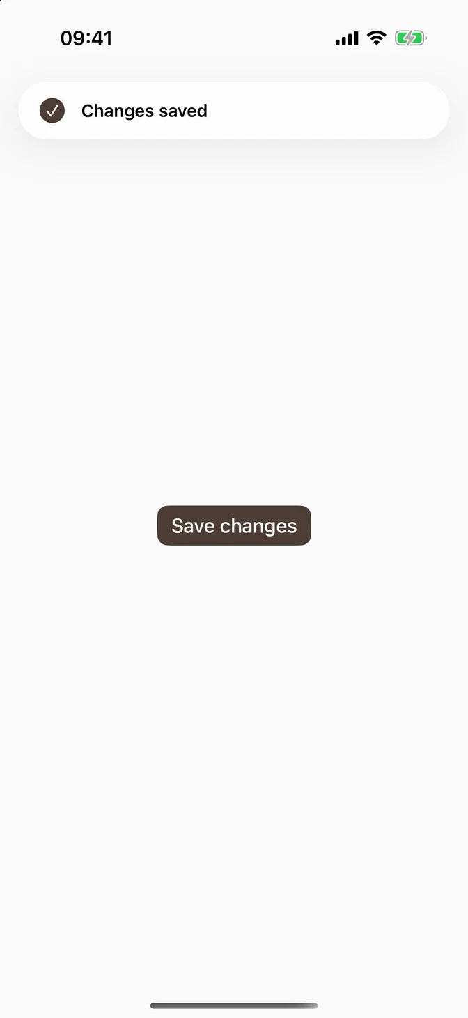
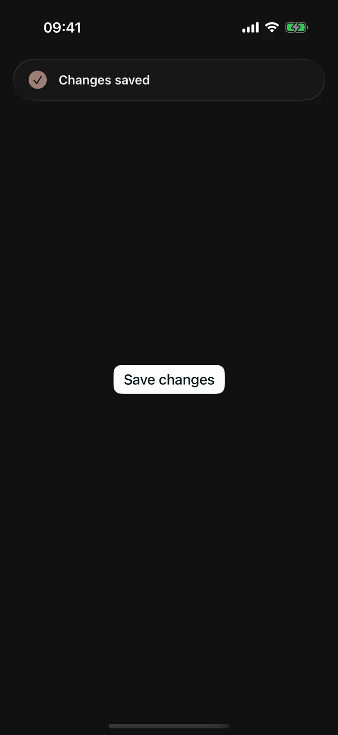
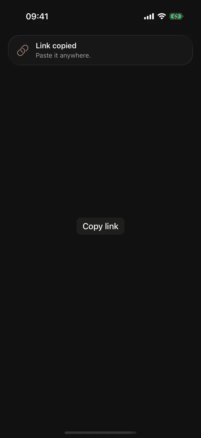
FLXToast with a checkmark and the title Changes saved
import SwiftUIstruct ToastUsageExample: View {    @State private var isSaved = false    var body: some View {        FLXButton("Save changes", variant: .primary) {            isSaved = true        }        .frame(maxWidth: .infinity, maxHeight: .infinity)        .flxToast("Changes saved", systemImage: "checkmark.circle.fill", isPresented: $isSaved)    }}

Installation

Requires the design system foundation (tokens and theme).

pnpm dlx shadcn@latest add @swiftui-flx/ios-toast

Usage

Apple has no toast API, so .flxToast follows the shape of .alert and .sheet: a binding shows it, and the toast sets it back to false when it goes away.

@State private var isSaved = falseFLXButton("Save changes", variant: .primary) {    isSaved = true}.flxToast("Changes saved", isPresented: $isSaved)

Use a toast for feedback about something the person just did. Errors and anything they must read belong in an alert.

Icon and message

systemImage adds an SF Symbol in the tint color, and message adds a line under the title.
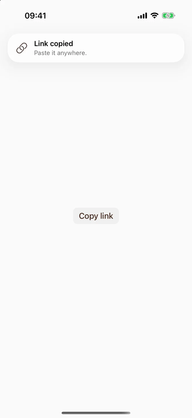
FLXToast with a link icon, a title, and a message
.flxToast(  "Link copied",  systemImage: "link",  isPresented: $isCopied,  message: "Paste it anywhere.")

Actions

Add actions with a trailing closure. A toast with actions doesn't time out: it stays until the person taps an action or the close button that FLX adds next to them. Every action closes the toast, like an alert's buttons.
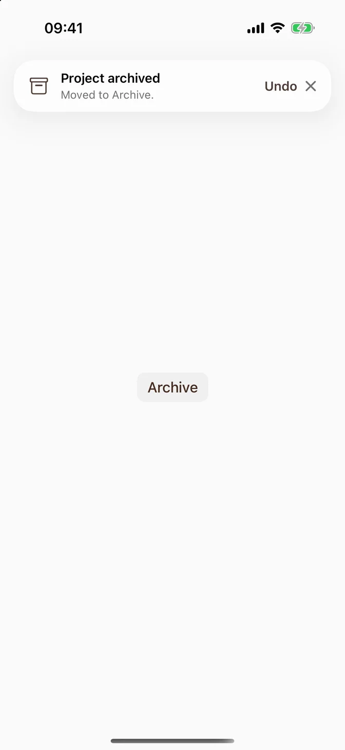
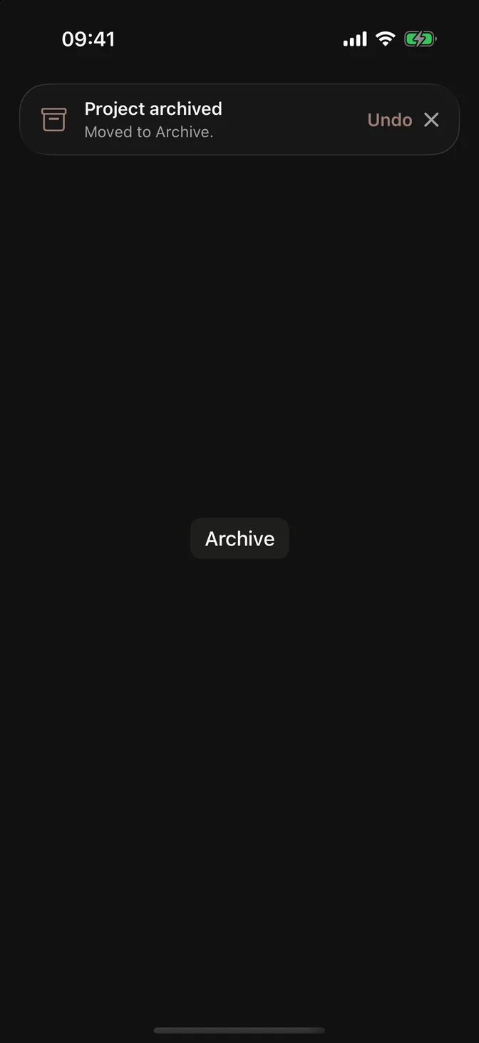
FLXToast with an Undo action and a close button
.flxToast(  "Project archived",  systemImage: "archivebox",  isPresented: $isArchived,  message: "Moved to Archive.") {  Button("Undo") {      restore()  }}

Don't give an action its own .buttonStyle(_:). The toast closes through its own button style, and the innermost style wins, so that button would stop closing the toast.

Item

Use isPresented: for one toast on the screen, and item: for several. The toast reads its title from an Identifiable value. A value with a new id replaces the toast; the same id with new data updates it in place without restarting its timer.
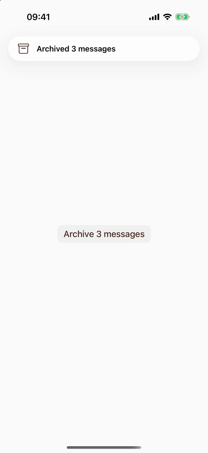
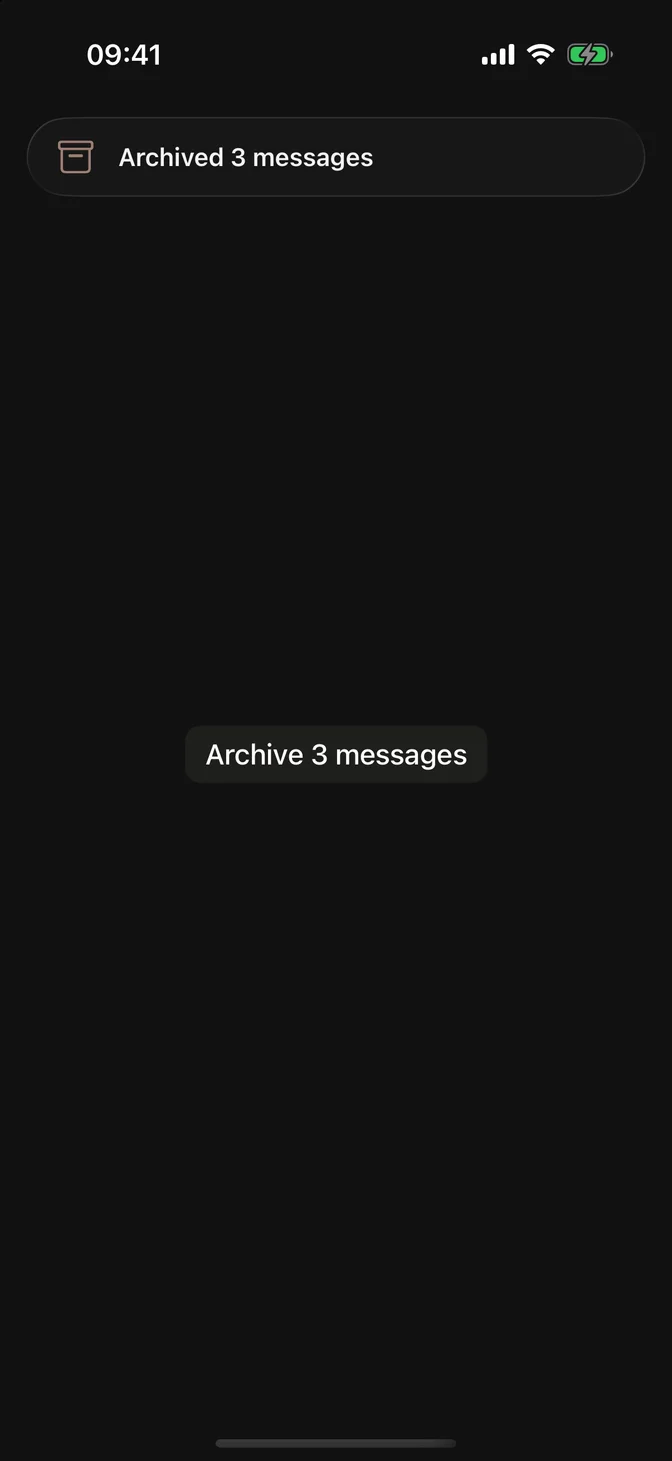
FLXToast presented from an item with the title Archived 3 messages
struct Archive: Identifiable {  let id = UUID()  let count: Int}@State private var archive: Archive?FLXButton("Archive 3 messages", variant: .secondary) {  archive = Archive(count: 3)}.flxToast(item: $archive, systemImage: "archivebox") { "Archived \($0.count) messages" }

systemImage, edge, and duration apply to the whole modifier. When different values need a different icon, give each its own .flxToast.

Duration

A toast without actions closes after 4 seconds. Give longer text more time with duration:, so people can finish reading it.
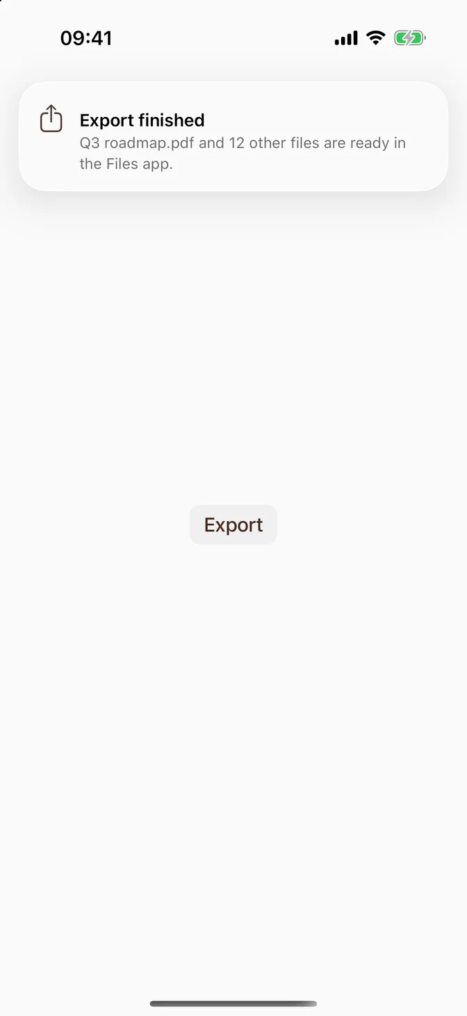
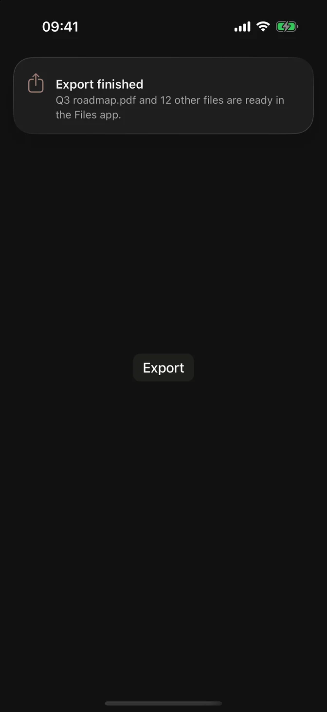
FLXToast with a two-line message
.flxToast(  "Export finished",  systemImage: "square.and.arrow.up",  isPresented: $isExported,  message: "Q3 roadmap.pdf and 12 other files are ready in the Files app.",  duration: .seconds(8))

The timer pauses while VoiceOver is on, while the pointer hovers over the toast, while it's being dragged, and while the app is in the background.

Edge

Toasts come in from the top. Use edge: .bottom when the top of the screen holds what the person is working on.
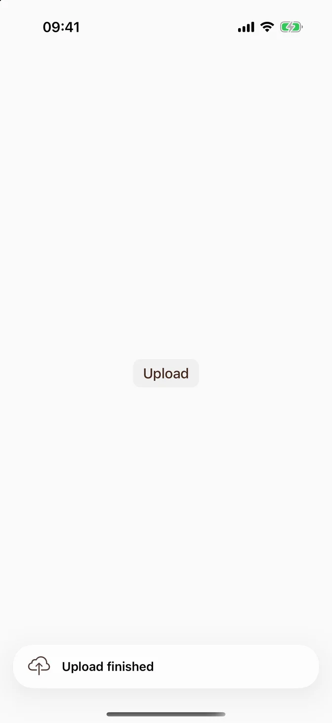
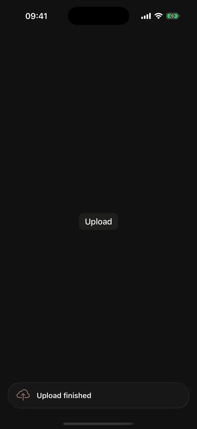
FLXToast at the bottom of the screen
.flxToast(  "Upload finished",  systemImage: "icloud.and.arrow.up",  isPresented: $isUploaded,  edge: .bottom)

Placement

Attach toasts to the root container, such as a NavigationStack or TabView. Attached to the content inside it, the toast sits below the navigation bar.
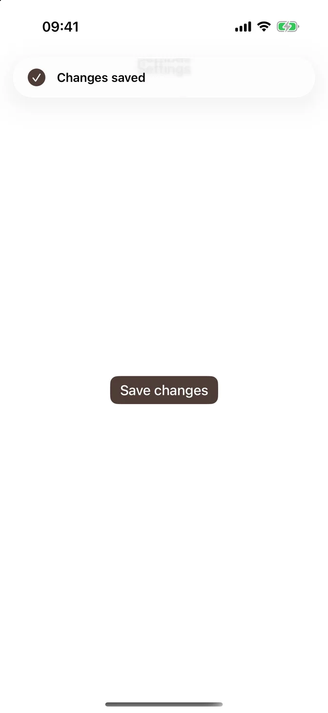
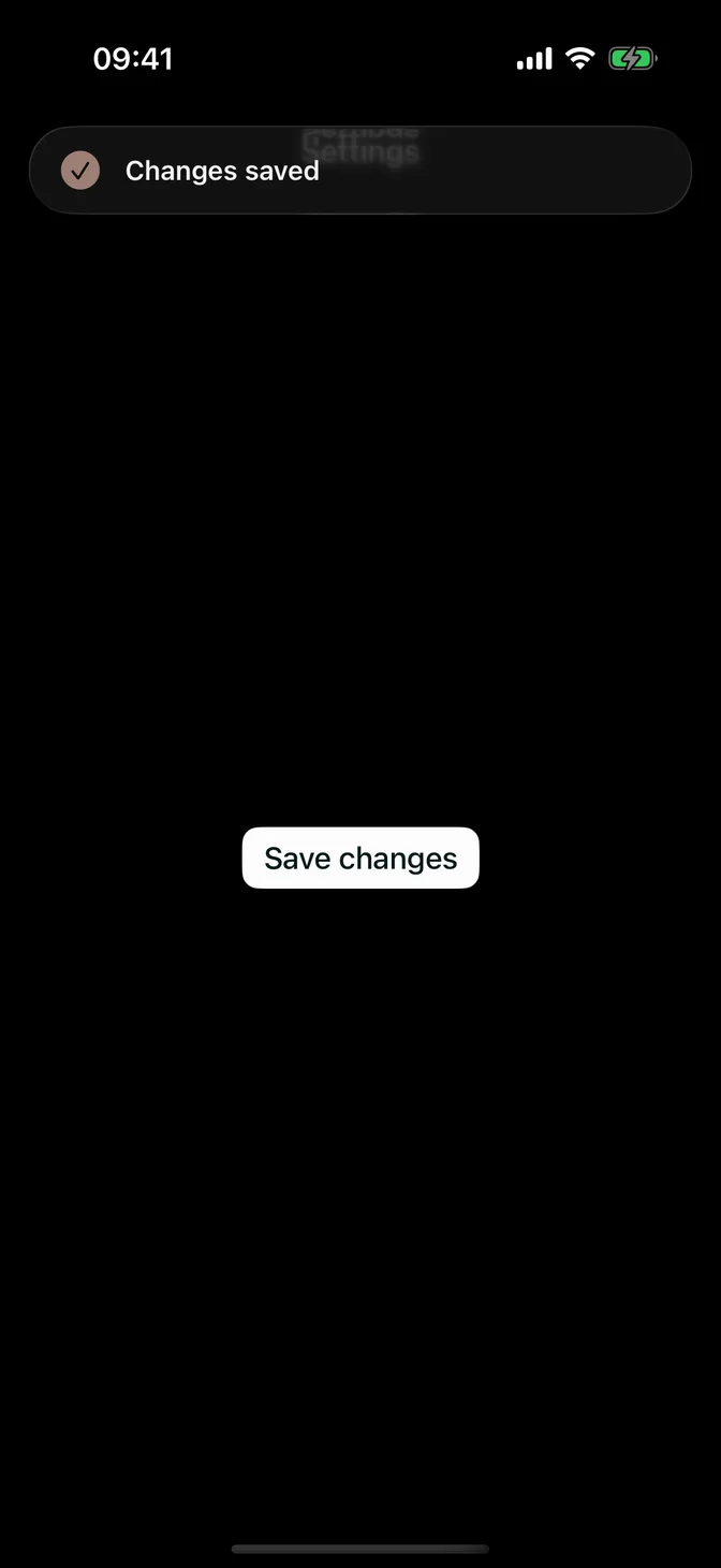
FLXToast over a navigation bar
NavigationStack {  SettingsView()      .navigationTitle("Settings")}.flxToast("Changes saved", systemImage: "checkmark.circle.fill", isPresented: $isSaved)

Only one toast shows at a time. The outermost .flxToast owns the spot, and every toast inside it, including those on pushed screens, goes there: the newest replaces the one on screen, whose binding goes back to false or nil. No setup is needed.

A sheet is presented apart from the screen behind it, so a sheet that shows toasts needs its own .flxToast on its root view:

.sheet(isPresented: $isEditing) {    NavigationStack {        EditView()    }    .flxToast("Draft saved", isPresented: $isDraftSaved)}

Text and translation

The title is a LocalizedStringResource, so a literal is translated and extracted to your String Catalog. Pass a String variable to show it as is, such as a file name.

The message is always a LocalizedStringResource. Put runtime values in through interpolation, which keeps the rest of the sentence translated:
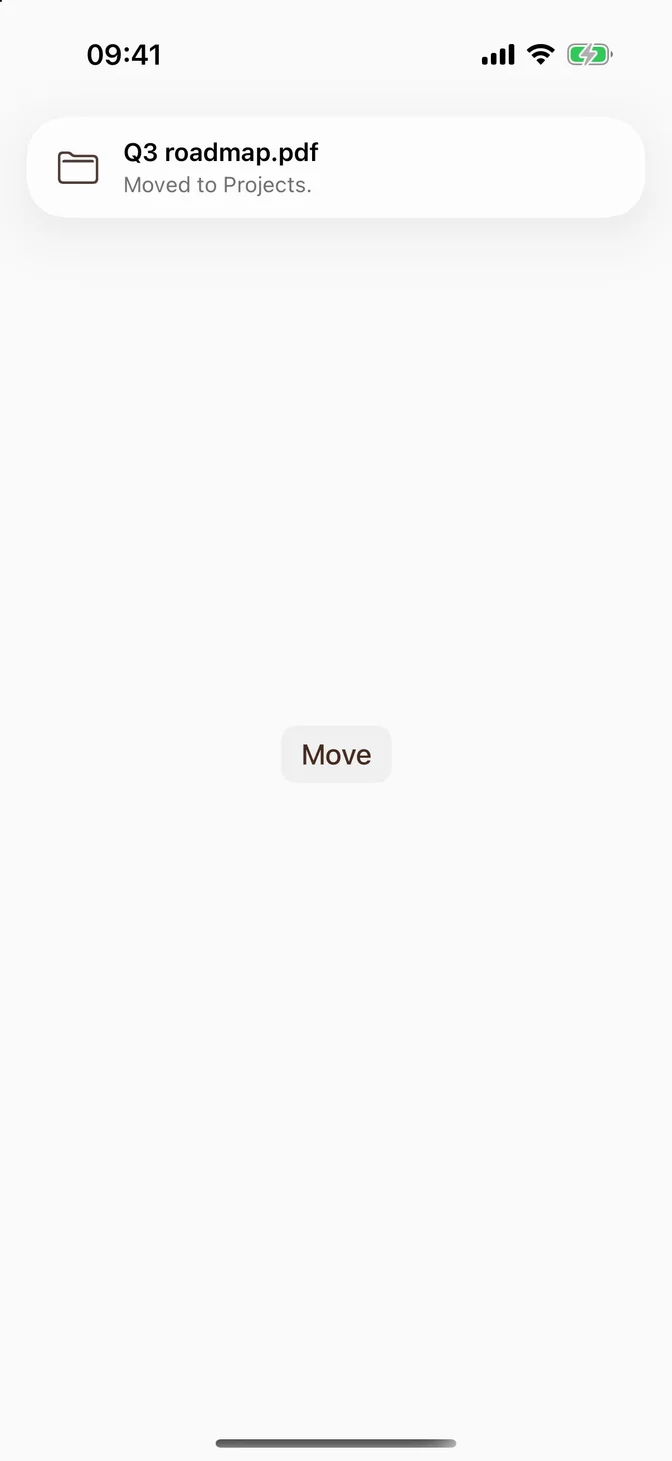
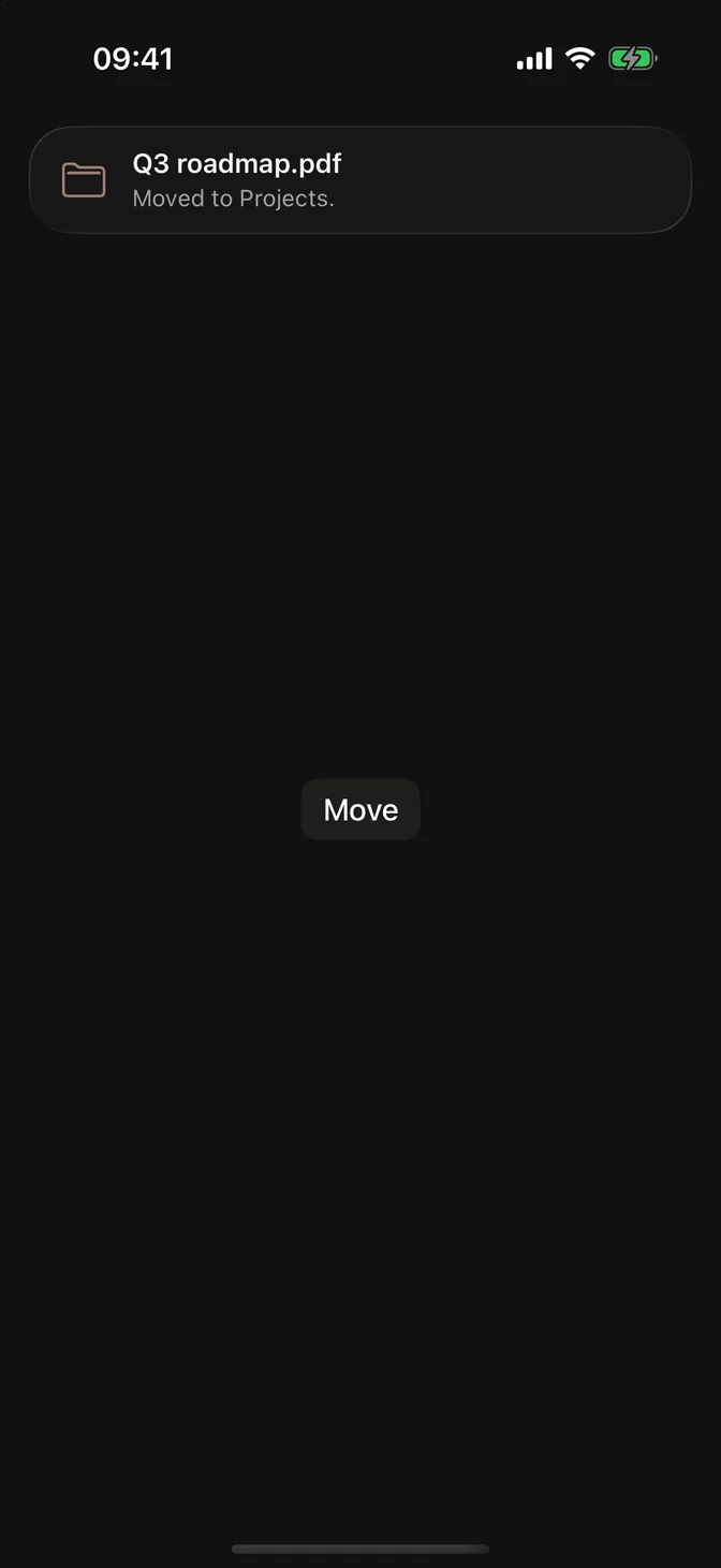
FLXToast with a file name as the title and a translated message
.flxToast(  fileName,  systemImage: "folder",  isPresented: $isMoved,  message: "Moved to \(folder).")

For a message that comes entirely from runtime, interpolate it on its own: message: "\(detail)". Passing a String directly doesn't compile, which keeps literals from silently losing their translation.

Haptics

The toast plays no sound or haptic. Add one with .sensoryFeedback(_:trigger:) (iOS 17 and later) on the same view:
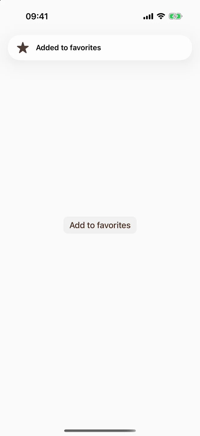
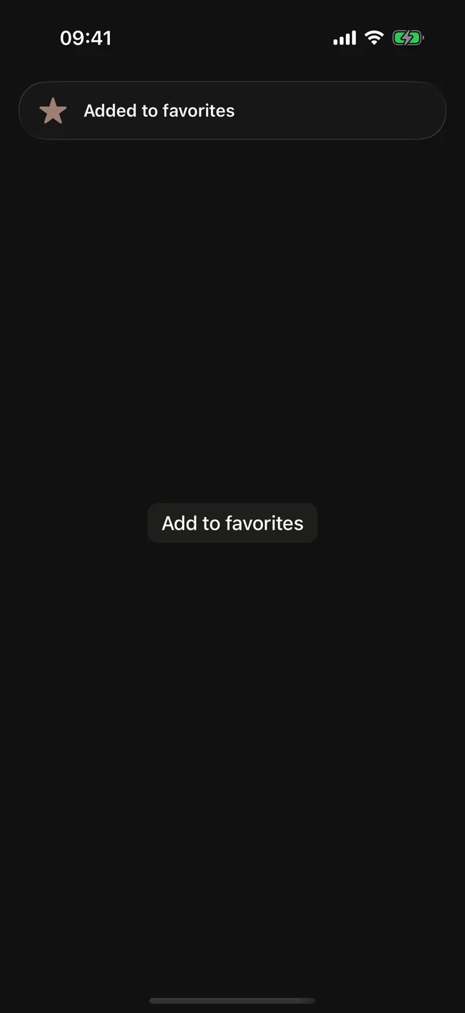
FLXToast with a star and the title Added to favorites
.flxToast("Added to favorites", systemImage: "star.fill", isPresented: $isFavorite).sensoryFeedback(.success, trigger: isFavorite)

Accessibility

  • VoiceOver announces the title and message when the toast appears (iOS 17 and later), and the toast never times out while VoiceOver is on.
  • Swiping toward the edge isn't the only way to close: a toast with actions has a close button, and VoiceOver's escape gesture closes any toast.
  • With Reduce Motion on, the toast fades instead of sliding.

Before iOS 26, the close button's label is Close, translated only when your String Catalog (Localizable.xcstrings) has that key. From iOS 26, the system close button brings its own translation.

"Close" : {  "localizations" : {    "pt-BR" : { "stringUnit" : { "state" : "translated", "value" : "Fechar" } }  }}

Custom styling

FLXToastStyle is an FLX protocol. Override it for a subtree via .flxToastStyle(_:). The surface uses Liquid Glass on iOS 26 and later and the regular material before it; a custom style draws its own.
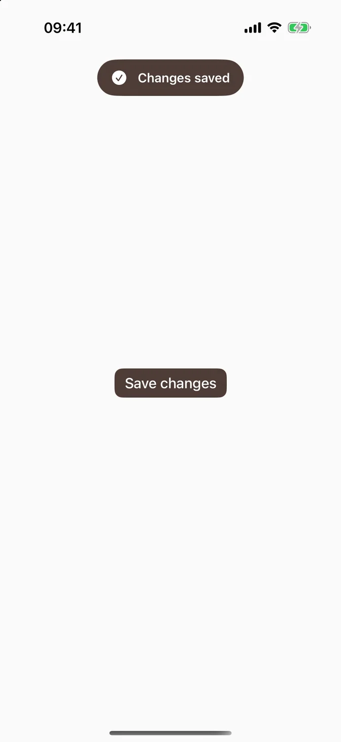
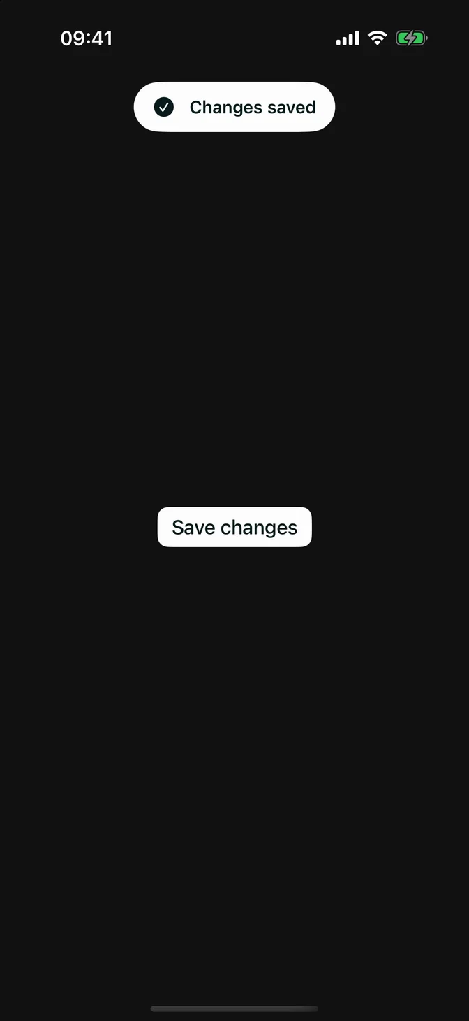
FLXToast with a solid capsule style
struct FLXSolidToastStyle: FLXToastStyle {  func makeBody(configuration: Configuration) -> some View {      FLXSolidToastStyleBody(configuration: configuration)  }}struct FLXSolidToastStyleBody: View {  @Environment(\.flxTheme) private var theme  let configuration: FLXToastStyleConfiguration  var body: some View {      HStack(spacing: FLXSpacing.md) {          if let systemImage = configuration.systemImage {              Image(systemName: systemImage)                  .accessibilityHidden(true)          }          VStack(alignment: .leading) {              configuration.title                  .flxFont(.subheadline, weight: .semibold)              if let message = configuration.message {                  message                      .flxFont(.footnote)              }          }          if let actions = configuration.actions {              Spacer(minLength: 0)              actions                  .buttonStyle(.borderless)                  .flxFont(.subheadline, weight: .semibold)          }      }      .foregroundStyle(theme.colors.primaryForeground)      .padding(.horizontal, FLXSpacing.lg)      .padding(.vertical, FLXSpacing.md)      .background(theme.colors.primary, in: Capsule())      .accessibilityElement(children: .contain)  }}ContentView()  .flxToastStyle(FLXSolidToastStyle())

configuration.actions already includes the close button and closes the toast when tapped, so the style only places it. It is nil for a toast without actions.

API Reference

flxToast(_:isPresented:)

func flxToast(    _ titleResource: LocalizedStringResource,    systemImage: String? = nil,    isPresented: Binding<Bool>,    message: LocalizedStringResource? = nil,    edge: VerticalEdge = .top,    duration: Duration = .seconds(4)) -> some Viewfunc flxToast<A: View>(    _ titleResource: LocalizedStringResource,    systemImage: String? = nil,    isPresented: Binding<Bool>,    message: LocalizedStringResource? = nil,    edge: VerticalEdge = .top,    @ViewBuilder actions: () -> A) -> some View

Both also take a StringProtocol title, shown as is.

flxToast(item:)

func flxToast<T: Identifiable>(    item: Binding<T?>,    systemImage: String? = nil,    edge: VerticalEdge = .top,    duration: Duration = .seconds(4),    title: (T) -> LocalizedStringResource,    message: ((T) -> LocalizedStringResource)? = nil) -> some Viewfunc flxToast<T: Identifiable, A: View>(    item: Binding<T?>,    systemImage: String? = nil,    edge: VerticalEdge = .top,    title: (T) -> LocalizedStringResource,    message: ((T) -> LocalizedStringResource)? = nil,    @ViewBuilder actions: (T) -> A) -> some View

The title closure can also return a StringProtocol value.

FLXToastStyleConfiguration

PropertyTypeDescription
titleTextThe toast's title.
messageText?The line under the title.
systemImageString?The SF Symbol name.
actionsActions?The actions and the close button, or nil for a toast that times out.