iOS 16.4+ iPadOS 16.4+
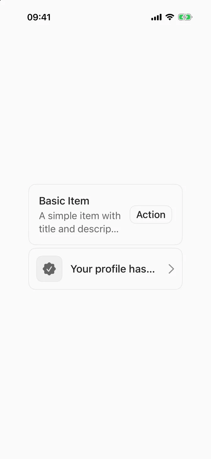
Displays a row of content, such as a list entry, notification, or settings row.
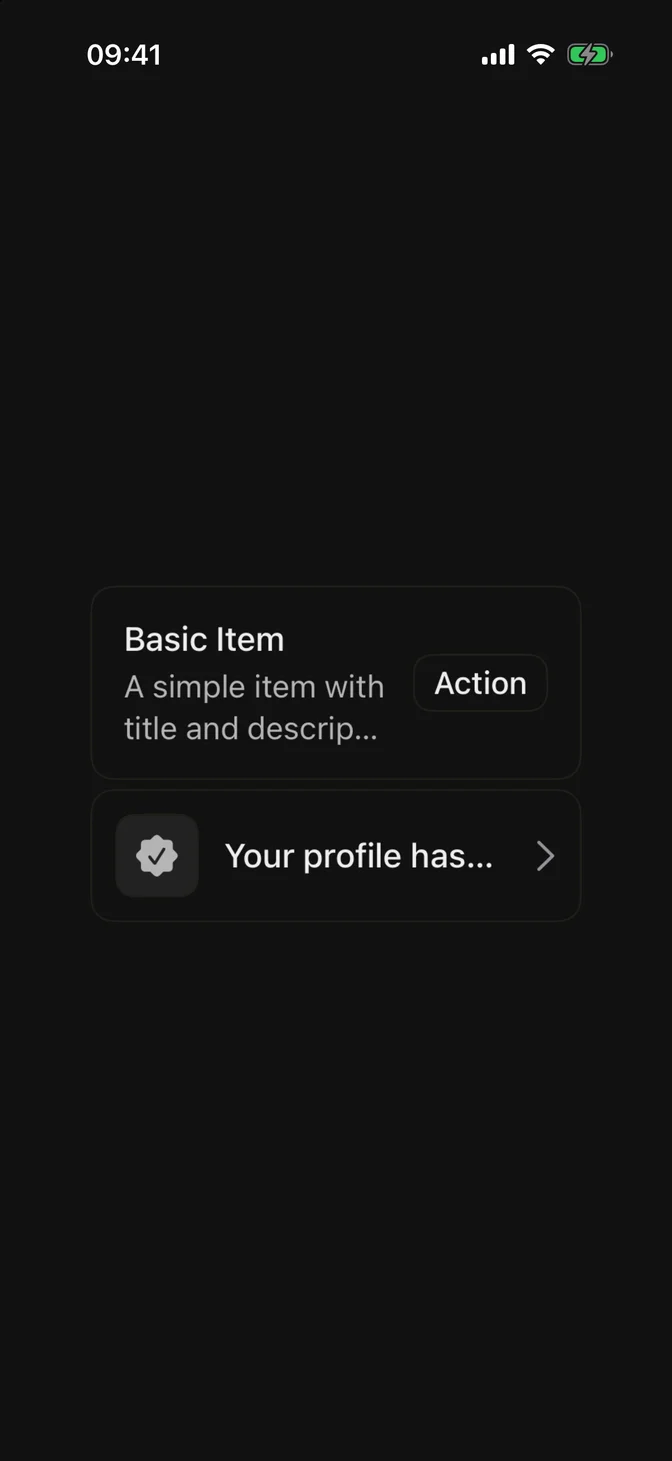
import SwiftUI struct ItemUsageExample : View { var body: some View { FLXItemGroup { FLXItem ( variant : .outline ) { FLXItemContent { FLXItemTitle ( "Basic Item" ) FLXItemDescription ( "A simple item with title and description." ) } FLXItemActions { FLXButton ( "Action" , variant : .outline ) {} . controlSize ( .small ) } } FLXItem ( variant : .outline, size : .small ) { FLXItemMedia ( variant : .icon ) { Image ( systemName : "checkmark.seal.fill" ) } FLXItemContent { FLXItemTitle ( "Your profile has been verified." ) } FLXItemActions { Image ( systemName : "chevron.right" ) . foregroundStyle ( .secondary ) } } } . padding ( FLXSpacing.xl ) } } Show more
Installation
Requires the design system foundation (tokens and theme).
CLI Manual
pnpm dlx shadcn@latest add @swiftui-flx/ios-itemUsage
FLXItem ( variant : .outline ) { FLXItemMedia ( variant : .icon ) { Image ( systemName : "bell.fill" ) } FLXItemContent { FLXItemTitle ( "Push notifications" ) FLXItemDescription ( "Get notified when someone mentions you." ) } FLXItemActions { FLXBadge ( "New" , variant : .secondary ) } } Composition
FLXItem lays its children out in an HStack; padding, background, and border come from FLXItemStyle. Use the following composition to build an item:
FLXItem ├── FLXItemMedia ├── FLXItemContent │ ├── FLXItemTitle │ └── FLXItemDescription └── FLXItemActions All sections are optional. FLXItemContent is a plain VStack.
For lists of items:
FLXItemGroup stacks multiple FLXItems with a tight gap.FLXItemSeparator draws a hairline divider between items inside a group.FLXItemHeader and FLXItemFooter are full-width HStacks for content above or below an item's main row.
Variants
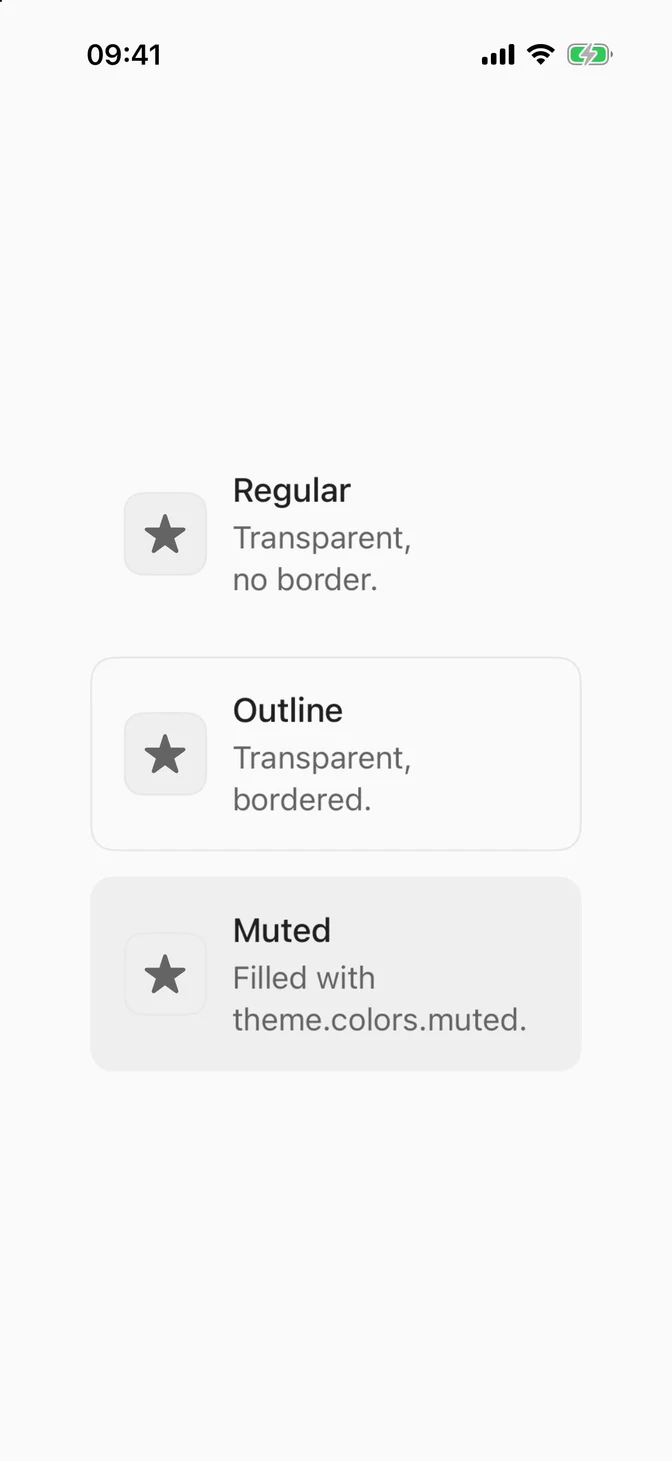
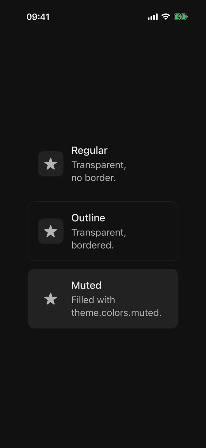
Three variants, set via variant:.
FLXItem ( variant : .regular ) { FLXItemMedia ( variant : .icon ) { Image ( systemName : "star.fill" ) } FLXItemContent { FLXItemTitle ( "Regular" ) FLXItemDescription ( "Transparent, no border." ) } } FLXItem ( variant : .outline ) { FLXItemMedia ( variant : .icon ) { Image ( systemName : "star.fill" ) } FLXItemContent { FLXItemTitle ( "Outline" ) FLXItemDescription ( "Transparent, bordered." ) } } FLXItem ( variant : .muted ) { FLXItemMedia ( variant : .icon ) { Image ( systemName : "star.fill" ) } FLXItemContent { FLXItemTitle ( "Muted" ) FLXItemDescription ( "Filled with theme.colors.muted." ) } } Sizes
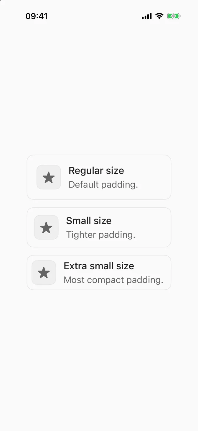
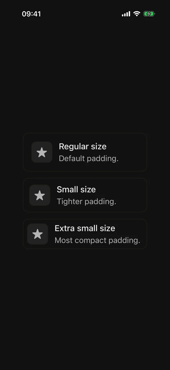
Three sizes, set via size:.
FLXItem ( variant : .outline, size : .regular ) { FLXItemMedia ( variant : .icon ) { Image ( systemName : "star.fill" ) } FLXItemContent { FLXItemTitle ( "Regular size" ) FLXItemDescription ( "Default padding." ) } } FLXItem ( variant : .outline, size : .small ) { FLXItemMedia ( variant : .icon ) { Image ( systemName : "star.fill" ) } FLXItemContent { FLXItemTitle ( "Small size" ) FLXItemDescription ( "Tighter padding." ) } } FLXItem ( variant : .outline, size : .extraSmall ) { FLXItemMedia ( variant : .icon ) { Image ( systemName : "star.fill" ) } FLXItemContent { FLXItemTitle ( "Extra small size" ) FLXItemDescription ( "Most compact padding." ) } } FLXItemMedia has three variants, set via variant:.
FLXItemMedia ( variant : .regular ) { Image ( systemName : "bell.fill" ) } FLXItemMedia ( variant : .icon ) { Image ( systemName : "bell.fill" ) } FLXItemMedia ( variant : . image ) { FLXAvatarImage ( url : URL ( string : "https://github.com/shadcn.png" )) } .regular renders the content as-is, .icon wraps it in a rounded muted square, and .image clips it to the same size.
Custom styling
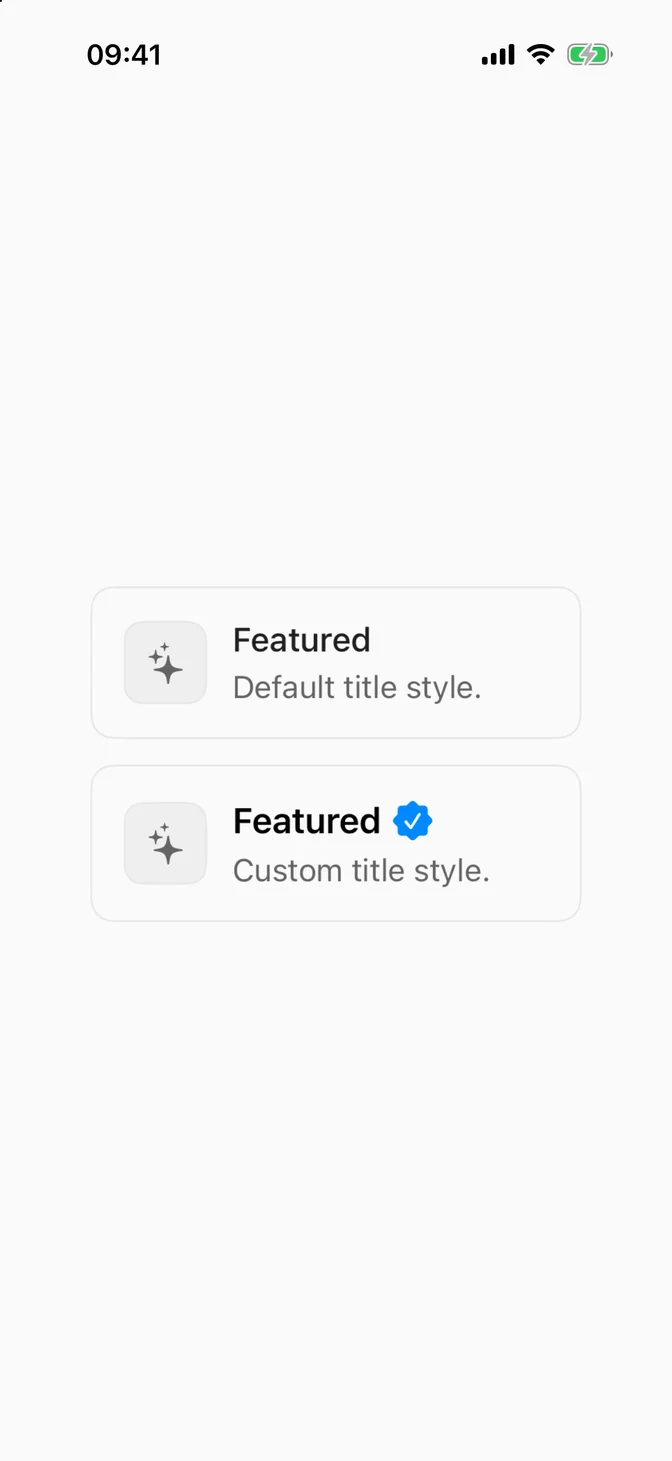
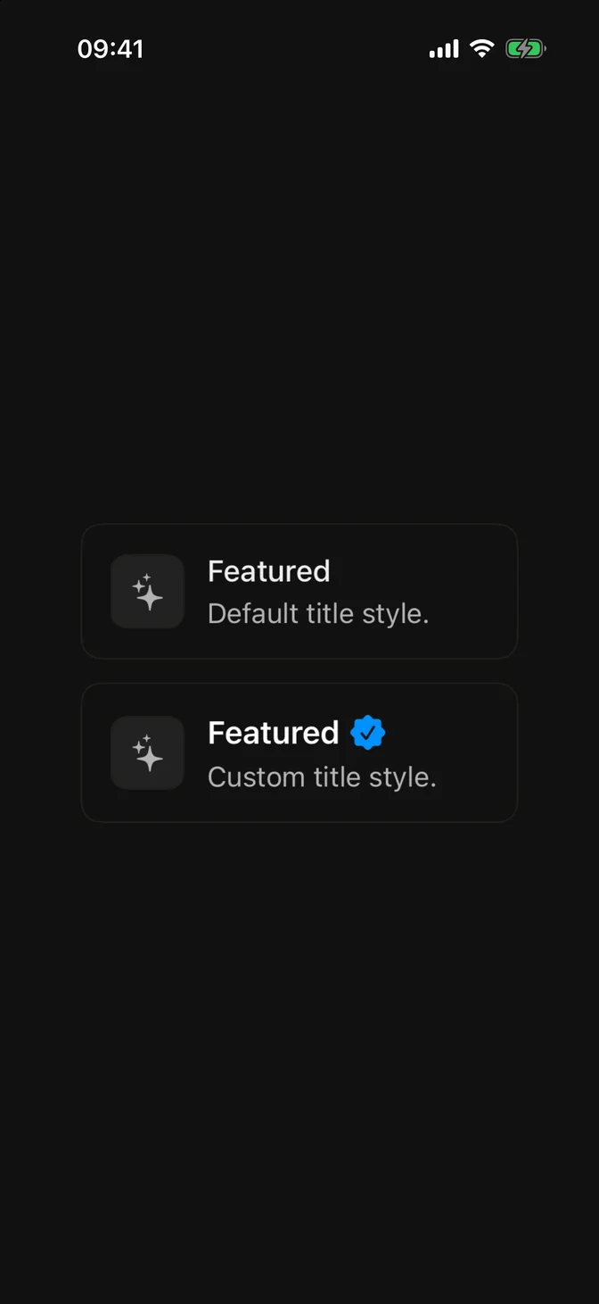
Each piece has its own FLX protocol: FLXItemStyle, FLXItemMediaStyle, FLXItemTitleStyle, FLXItemDescriptionStyle, and FLXItemSeparatorStyle. Override any of them for a subtree via the matching modifier, e.g. .flxItemTitleStyle(_:):
struct FLXVerifiedItemTitleStyle : FLXItemTitleStyle { func makeBody ( configuration : Configuration) -> some View { HStack ( spacing : FLXSpacing.xs ) { configuration.title . flxFont ( .headline ) Image ( systemName : "checkmark.seal.fill" ) . foregroundStyle ( .blue ) } } } VStack ( spacing : FLXSpacing.md ) { FLXItem ( variant : .outline ) { FLXItemMedia ( variant : .icon ) { Image ( systemName : "sparkles" ) } FLXItemContent { FLXItemTitle ( "Featured" ) FLXItemDescription ( "Default title style." ) } } FLXItem ( variant : .outline ) { FLXItemMedia ( variant : .icon ) { Image ( systemName : "sparkles" ) } FLXItemContent { FLXItemTitle ( "Featured" ) FLXItemDescription ( "Custom title style." ) } } . flxItemTitleStyle ( FLXVerifiedItemTitleStyle ()) } Show more
API Reference
FLXItem
init ( variant : FLXItemVariant = .regular, size : FLXItemSize = .regular, @ ViewBuilder content : @escaping () -> Content ) init ( variant : FLXItemMediaVariant = .regular, @ ViewBuilder content : @escaping () -> Content ) FLXItemContent
init (@ ViewBuilder content : @escaping () -> Content) FLXItemTitle
init ( _ titleKey : LocalizedStringKey) init ( _ titleResource : LocalizedStringResource) init < S : StringProtocol > ( _ title : S) FLXItemDescription
init ( _ textKey : LocalizedStringKey) init ( _ textResource : LocalizedStringResource) init < S : StringProtocol > ( _ text : S) FLXItemActions
init (@ ViewBuilder content : @escaping () -> Content) init (@ ViewBuilder content : @escaping () -> Content) init (@ ViewBuilder content : @escaping () -> Content) FLXItemGroup
init (@ ViewBuilder content : @escaping () -> Content) FLXItemSeparator
Variants
Sizes