Card

iOS 16.4+iPadOS 16.4+

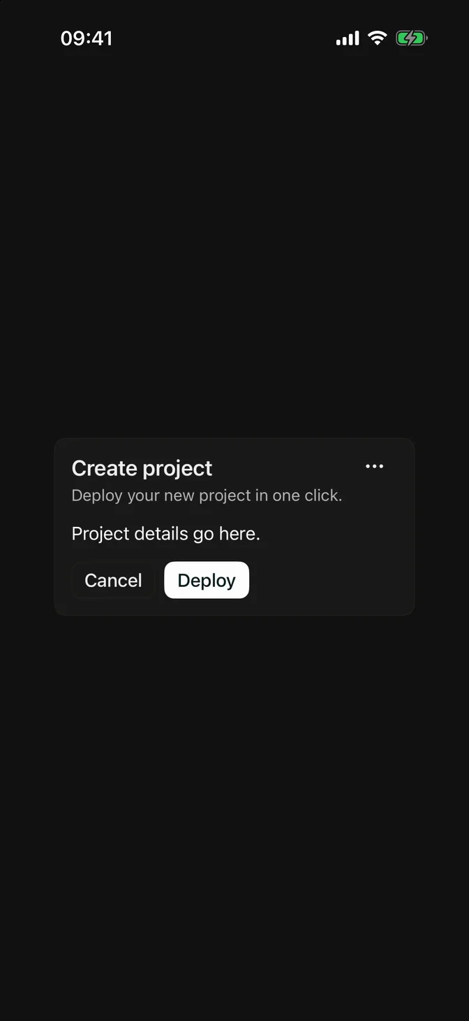
A card is a container that can be used to display content in a styled way.
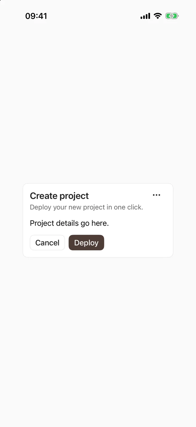
FLXCard example
import SwiftUIstruct CardUsageExample: View {    var body: some View {        FLXCard {            FLXCardHeader {                HStack(alignment: .top) {                    VStack(alignment: .leading, spacing: FLXSpacing.xs) {                        FLXCardTitle("Create project")                        FLXCardDescription("Deploy your new project in one click.")                    }                    Spacer()                    FLXButton("More", systemImage: "ellipsis", variant: .ghost) {}                        .labelStyle(.iconOnly)                }            }            FLXCardContent {                Text("Project details go here.")                    .flxFont(.body)            }            FLXCardFooter {                FLXButton("Cancel", variant: .outline) {}                FLXButton("Deploy", variant: .primary) {}            }        }        .padding(FLXSpacing.xl)    }}

Installation

Requires the design system foundation (tokens and theme).

pnpm dlx shadcn@latest add https://swiftui.flexnative.com/r/ios-card.json

Usage

FLXCard {    FLXCardHeader {        FLXCardTitle("Create project")        FLXCardDescription("Deploy your new project in one click.")    }    FLXCardContent {        Text("Project details go here.")    }    FLXCardFooter {        FLXButton("Cancel", variant: .outline) {}        FLXButton("Deploy", variant: .primary) {}    }}

Composition

FLXCard is a plain container, so pick whichever sections you need. Use the following composition to build a card:

FLXCard├── FLXCardHeader│   ├── FLXCardTitle│   └── FLXCardDescription├── FLXCardContent└── FLXCardFooter

None of the sections are required, and FLXCardHeader is a plain VStack, so you can lay out its contents however you like.

Custom styling

FLXCardStyle, FLXCardTitleStyle, and FLXCardDescriptionStyle are FLX protocols. Override each independently for a subtree via .flxCardStyle(_:), .flxCardTitleStyle(_:), and .flxCardDescriptionStyle(_:):


FLXCard custom styling
struct FLXOutlinedCardStyle: FLXCardStyle {  func makeBody(configuration: Configuration) -> some View {      FLXOutlinedCardStyleBody(configuration: configuration)  }}struct FLXOutlinedCardStyleBody: View {  @Environment(\.flxTheme) private var theme  let configuration: FLXCardStyleConfiguration  var body: some View {      VStack(alignment: .leading, spacing: FLXSpacing.lg) {          configuration.content      }      .padding(FLXSpacing.lg)      .overlay(          RoundedRectangle(cornerRadius: theme.radius.lg)              .strokeBorder(.blue, lineWidth: FLXBorderWidth.thick)      )  }}HStack(spacing: FLXSpacing.md) {  FLXCard {      FLXCardHeader {          FLXCardTitle("Featured")      }  }  FLXCard {      FLXCardHeader {          FLXCardTitle("Featured")      }  }  .flxCardStyle(FLXOutlinedCardStyle())}

API Reference

FLXCard

init(@ViewBuilder content: @escaping () -> Content)

FLXCardHeader

init(@ViewBuilder content: @escaping () -> Content)

FLXCardTitle

init(_ titleKey: LocalizedStringKey)init(_ titleResource: LocalizedStringResource)init<S: StringProtocol>(_ title: S)

FLXCardDescription

init(_ textKey: LocalizedStringKey)init(_ textResource: LocalizedStringResource)init<S: StringProtocol>(_ text: S)

FLXCardContent

init(@ViewBuilder content: @escaping () -> Content)

FLXCardFooter

init(@ViewBuilder content: @escaping () -> Content)