iOS 16.4+iPadOS 16.4+
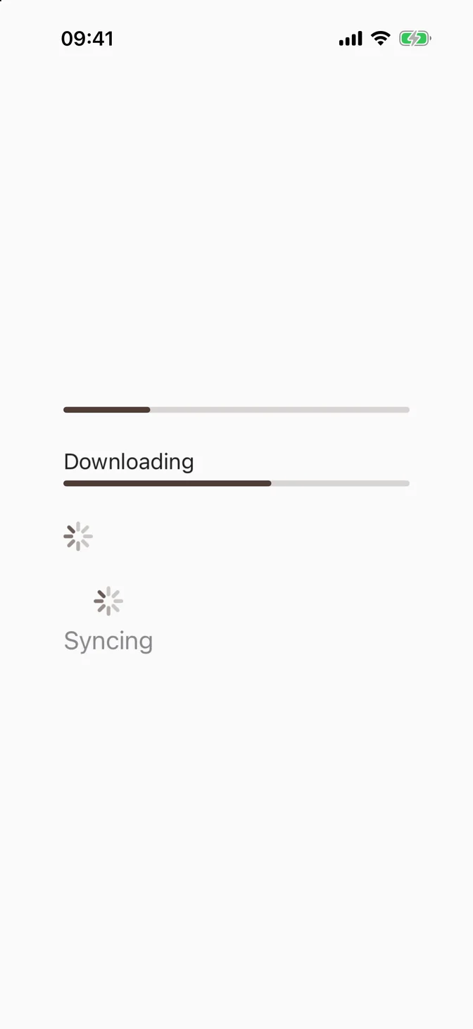
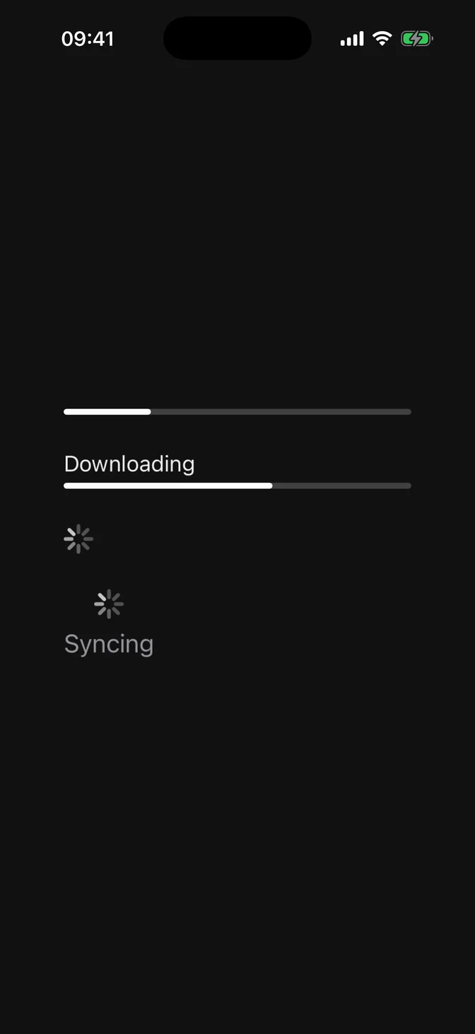
Displays progress toward completion of a task, as a bar or a spinner.
Installation
Requires the design system foundation (tokens and theme).
Usage
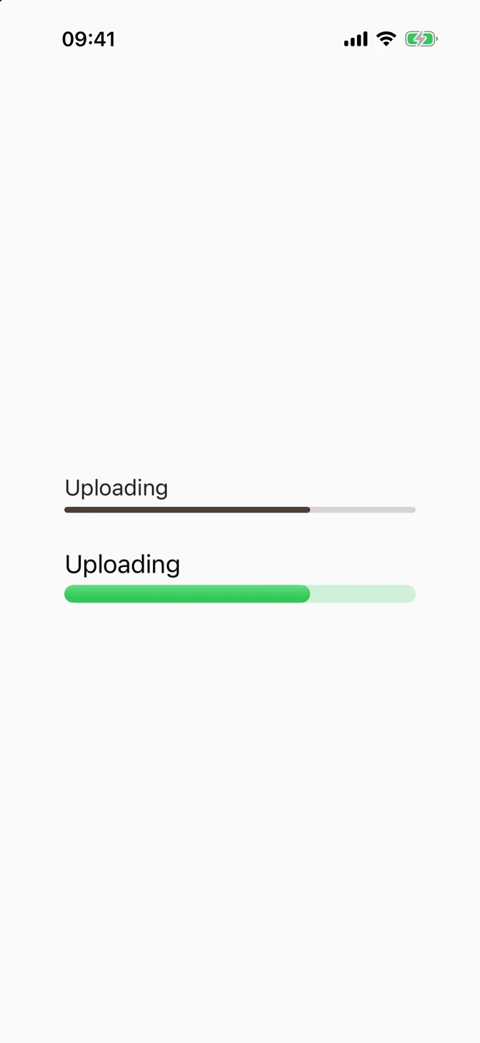
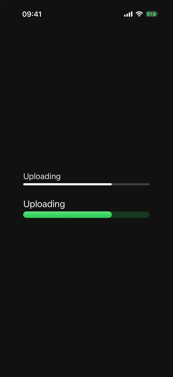
Pass value for a linear bar, or omit it for a circular spinner.
The label/currentValueLabel initializer takes views. label renders above the bar, currentValueLabel below it:
Variants
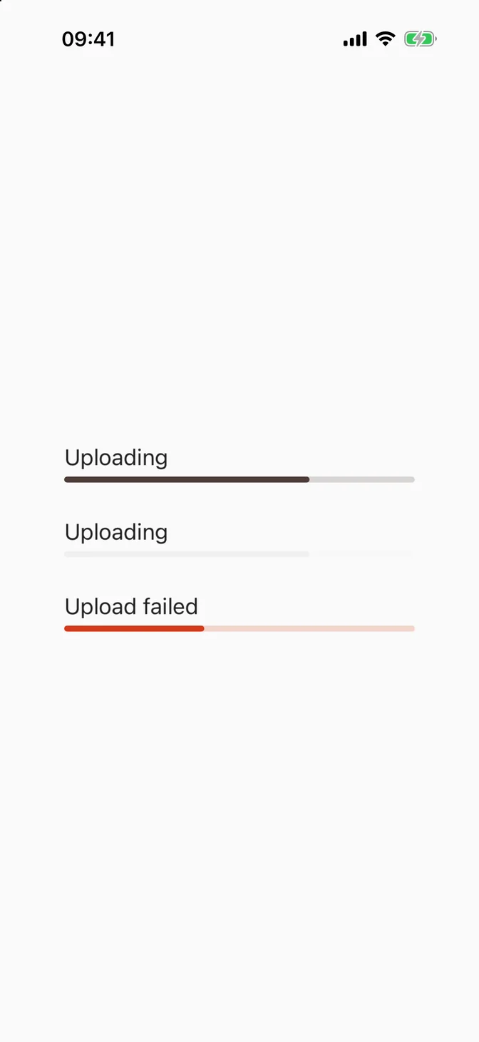
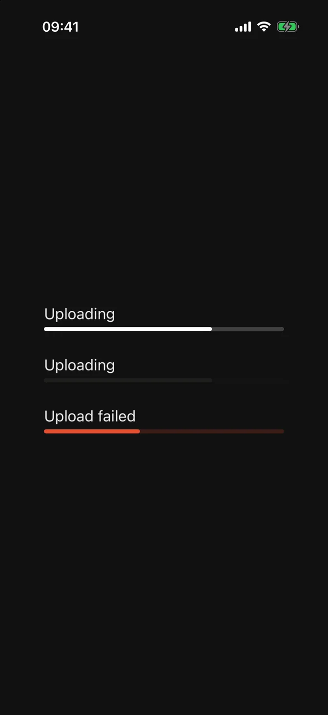
Three variants, set via variant:.
Sizes
The spinner is sized via .controlSize(_:), like the native ProgressView. The bar keeps a fixed 4pt track, like the native one on iPhone.
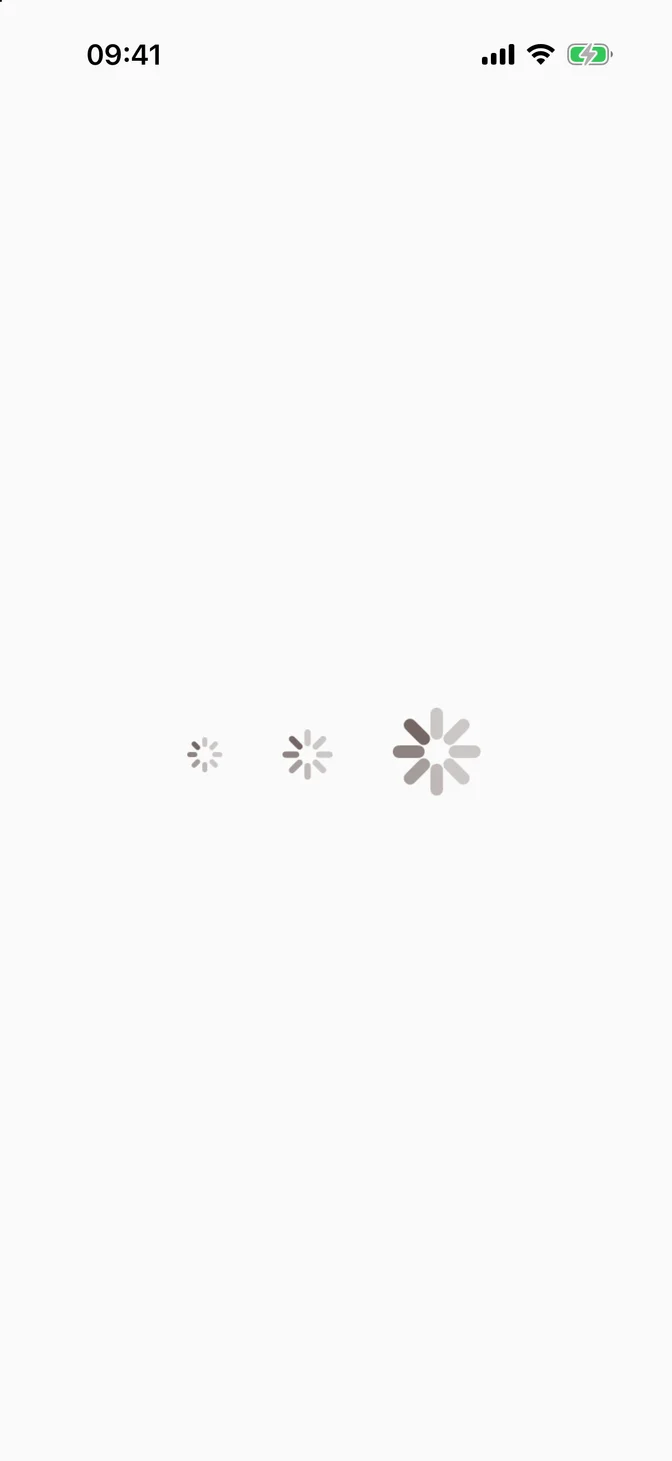
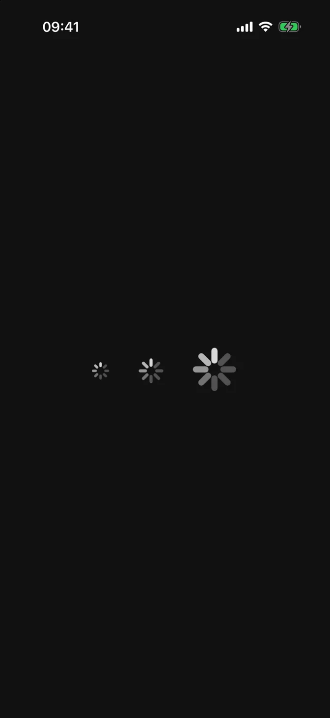
Custom styling
FLXProgressViewStyle conforms to SwiftUI's native ProgressViewStyle. Override rendering for a subtree with any ProgressViewStyle via .flxProgressViewStyle(_:):
API Reference
FLXProgressView
Variants
For more information about FLXProgressView props, see the Apple documentation.