macOS 13.3+
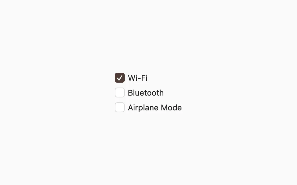
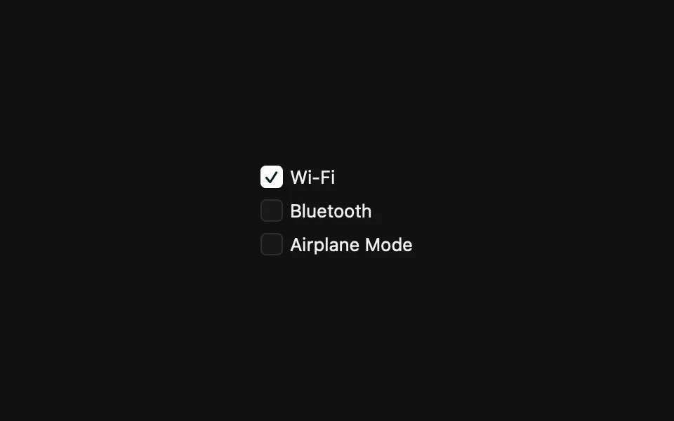
Displays a checkbox for an on/off value.
Installation
Requires the design system foundation (tokens and theme).
Usage
FLXToggle is always controlled via isOn. On macOS it draws a checkbox, like SwiftUI's default Toggle on the Mac, with the label on the trailing side. The box follows .controlSize(_:).
Custom styling
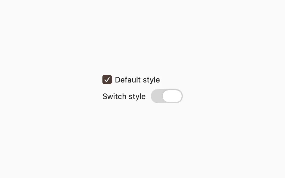
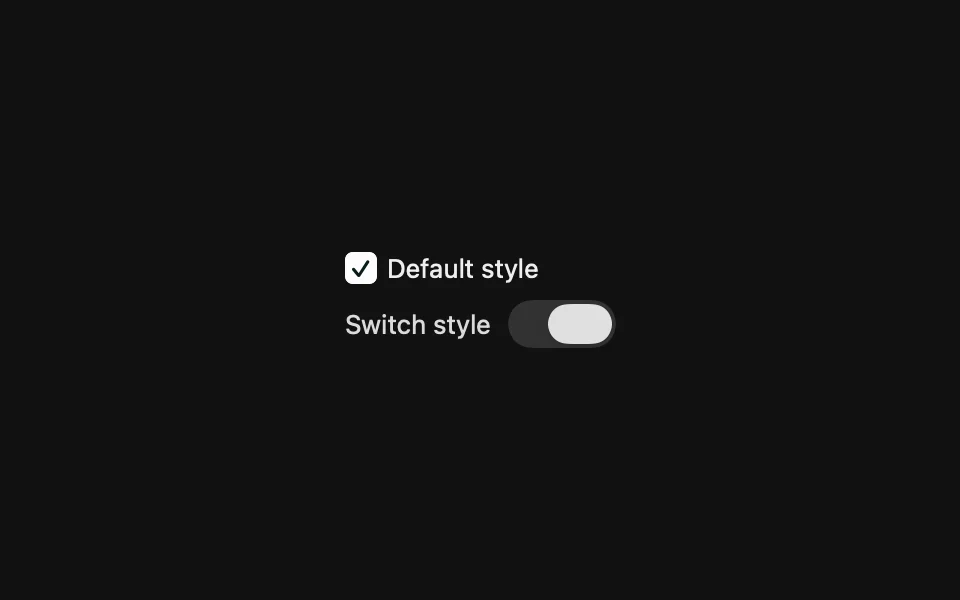
FLXToggleStyle conforms to SwiftUI's native ToggleStyle. Override rendering for a subtree with any ToggleStyle via .flxToggleStyle(_:):
API Reference
FLXToggle
For more information about FLXToggle props, see the Apple documentation.