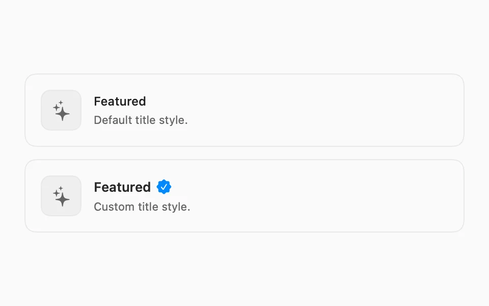
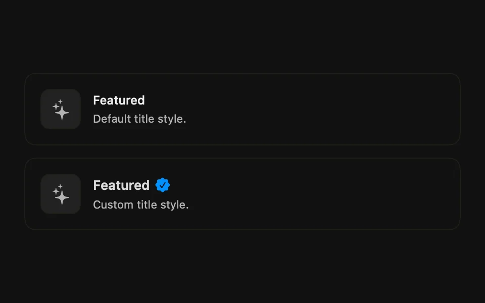
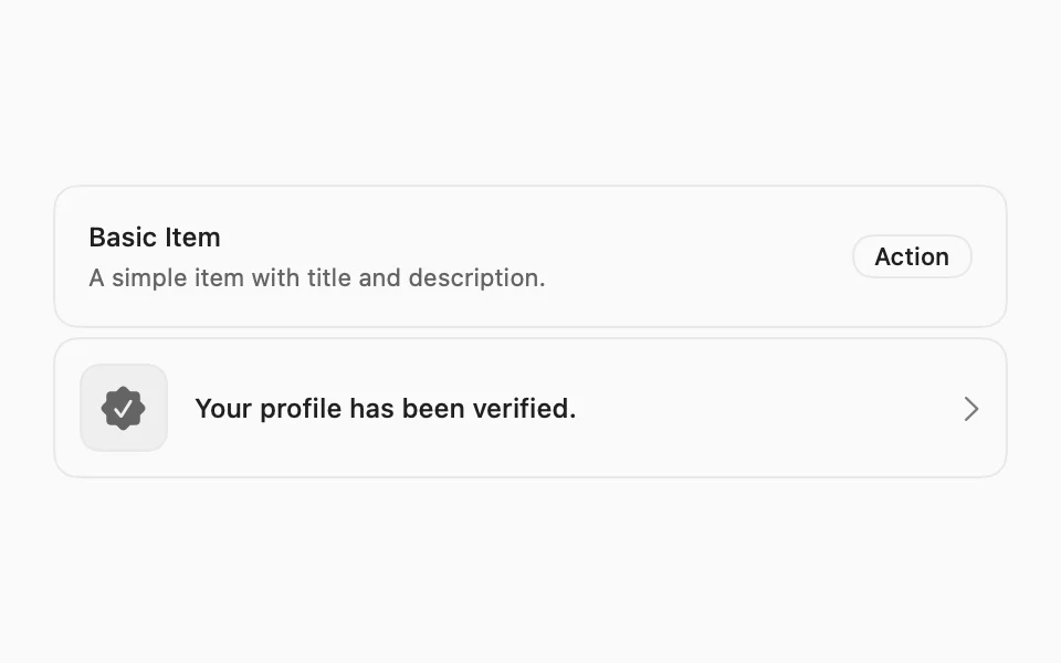
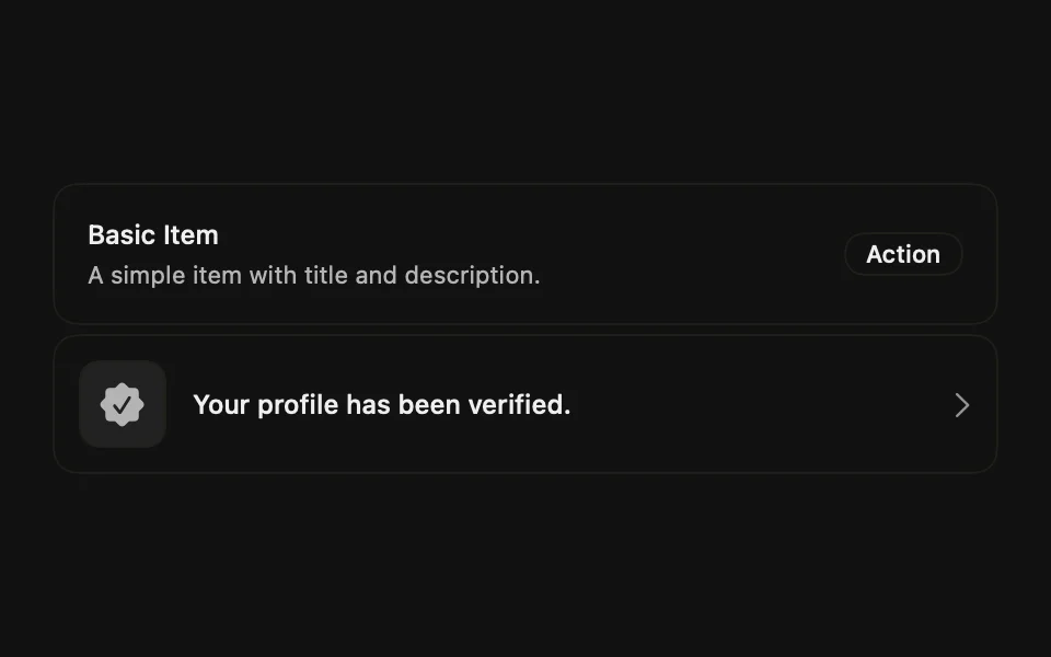
Displays a row of content, such as a list entry, notification, or settings row.
Installation
Requires the design system foundation (tokens and theme).
Usage
Composition
FLXItem lays its children out in an HStack; padding, background, and border come from FLXItemStyle. Use the following composition to build an item:
All sections are optional. FLXItemContent is a plain VStack.
For lists of items:
FLXItemGroupstacks multipleFLXItems with a tight gap.FLXItemSeparatordraws a hairline divider between items inside a group.FLXItemHeaderandFLXItemFooterare full-widthHStacks for content above or below an item's main row.
Variants
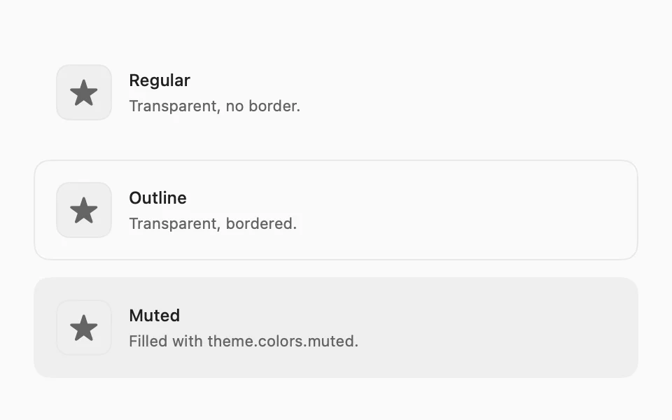
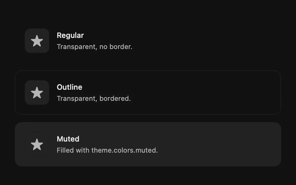
Three variants, set via variant:.
Sizes
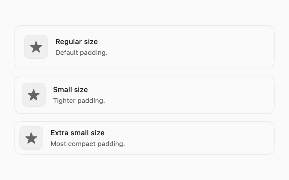
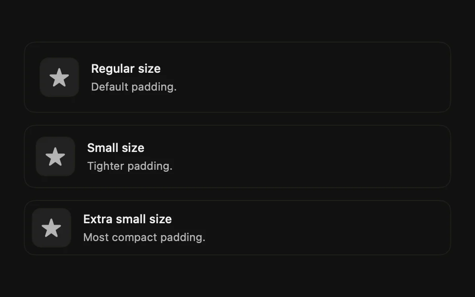
Three sizes, set via size:.
Media
FLXItemMedia has three variants, set via variant:.

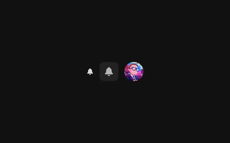
.regular renders the content as-is, .icon wraps it in a rounded muted square, and .image clips it to the same size.
Custom styling
Each piece has its own FLX protocol: FLXItemStyle, FLXItemMediaStyle, FLXItemTitleStyle, FLXItemDescriptionStyle, and FLXItemSeparatorStyle. Override any of them for a subtree via the matching modifier, e.g. .flxItemTitleStyle(_:):