Progress View

macOS 13.3+

Displays progress toward completion of a task, as a bar or a spinner.
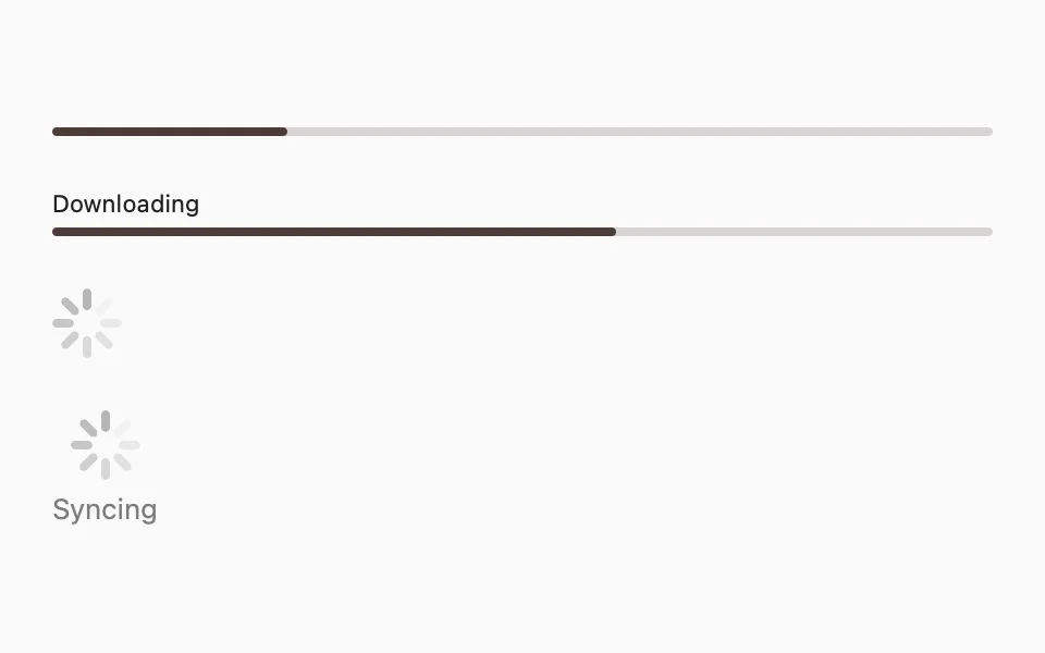
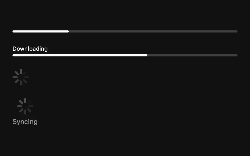
import SwiftUIstruct ProgressViewUsageExample: View {    var body: some View {        VStack(alignment: .leading, spacing: FLXSpacing.xl) {            FLXProgressView(value: 0.25)            FLXProgressView("Downloading", value: 0.6)            FLXProgressView()            FLXProgressView("Syncing")        }        .padding(FLXSpacing.xl)    }}

Installation

Requires the design system foundation (tokens and theme).

pnpm dlx shadcn@latest add https://swiftui.flexnative.com/r/mac-progress-view.json

Usage

FLXProgressView("Downloading", value: 0.6)

Pass value for a linear bar, or omit it for a circular spinner.

The label/currentValueLabel initializer takes views. label renders above the bar, currentValueLabel below it:

FLXProgressView(value: 0.6) {    Text("Downloading")} currentValueLabel: {    Text("60%")}

Variants

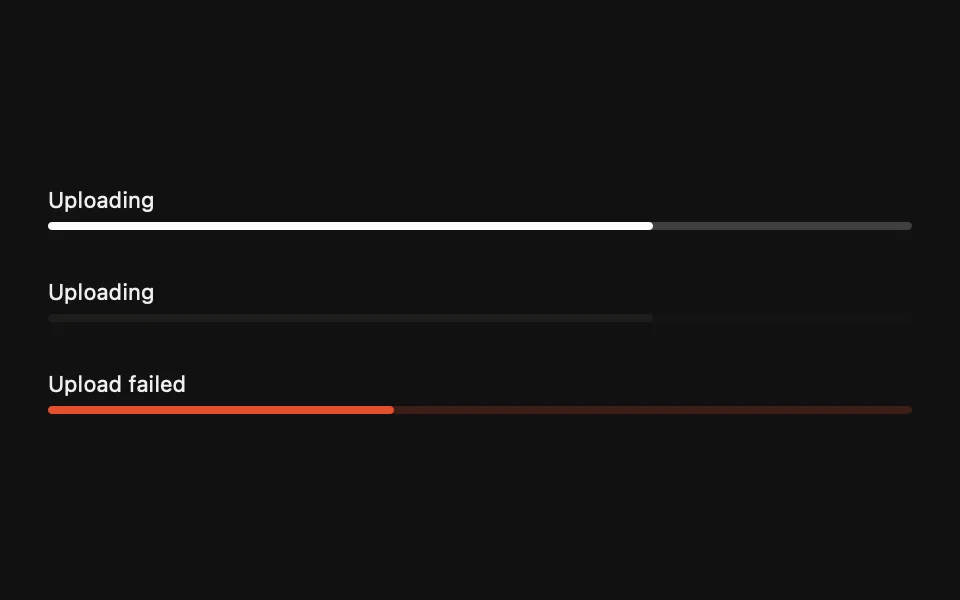
Three variants, set via variant:.
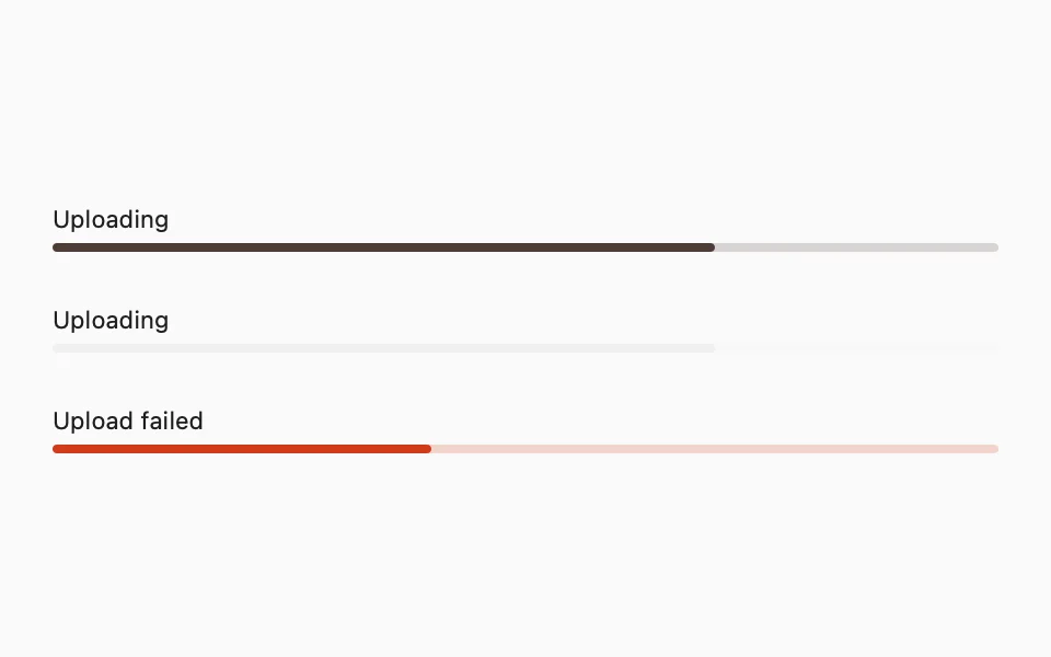
FLXProgressView("Uploading", value: 0.7, variant: .primary)FLXProgressView("Uploading", value: 0.7, variant: .secondary)FLXProgressView("Upload failed", value: 0.4, variant: .destructive)

Sizes

The spinner is sized via .controlSize(_:), like the native ProgressView. The bar keeps a fixed 4pt track.


FLXProgressView()  .controlSize(.small)FLXProgressView()FLXProgressView()  .controlSize(.large)

Custom styling

FLXProgressViewStyle conforms to SwiftUI's native ProgressViewStyle. Override rendering for a subtree with any ProgressViewStyle via .flxProgressViewStyle(_:):
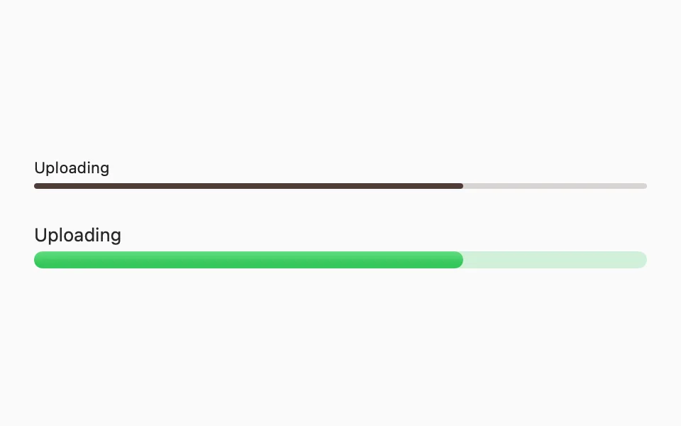
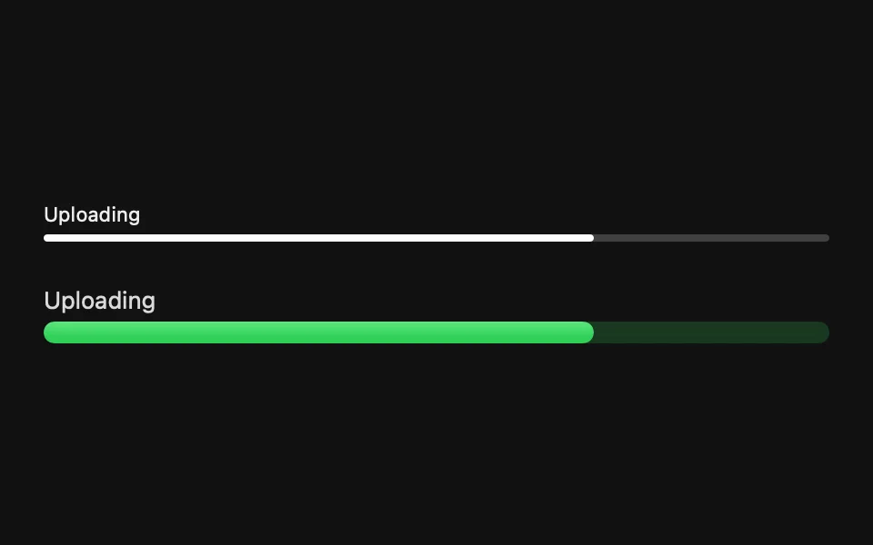
struct FLXThickProgressViewStyle: ProgressViewStyle {  func makeBody(configuration: Configuration) -> some View {      if let fractionCompleted = configuration.fractionCompleted {          VStack(alignment: .leading, spacing: FLXSpacing.xs) {              configuration.label              Capsule()                  .fill(.green.opacity(0.2))                  .frame(height: FLXSpacing.md)                  .overlay(alignment: .leading) {                      GeometryReader { proxy in                          Capsule()                              .fill(.green.gradient)                              .frame(width: proxy.size.width * fractionCompleted)                      }                  }          }      } else {          ProgressView(configuration)              .tint(.green)      }  }}VStack(alignment: .leading, spacing: FLXSpacing.xl) {  FLXProgressView("Uploading", value: 0.7)  FLXProgressView("Uploading", value: 0.7)      .flxProgressViewStyle(FLXThickProgressViewStyle())}

API Reference

FLXProgressView

init(    value: Double? = nil,    total: Double = 1.0,    variant: FLXProgressViewVariant = .primary,    @ViewBuilder label: @escaping () -> Label,    @ViewBuilder currentValueLabel: @escaping () -> CurrentValueLabel)init(    value: Double? = nil,    total: Double = 1.0,    variant: FLXProgressViewVariant = .primary)init(    _ titleKey: LocalizedStringKey,    value: Double? = nil,    total: Double = 1.0,    variant: FLXProgressViewVariant = .primary)init(    _ titleResource: LocalizedStringResource,    value: Double? = nil,    total: Double = 1.0,    variant: FLXProgressViewVariant = .primary)init<S: StringProtocol>(    _ title: S,    value: Double? = nil,    total: Double = 1.0,    variant: FLXProgressViewVariant = .primary)

Variants

CaseDescription
primaryFilled with theme.colors.primary.
secondaryFilled with theme.colors.secondary.
destructiveFilled with theme.colors.destructive.

For more information about FLXProgressView props, see the Apple documentation.