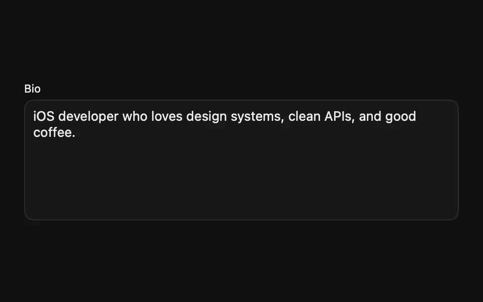
Text Editor

macOS 13.3+

Displays a multi-line text input for long-form content.
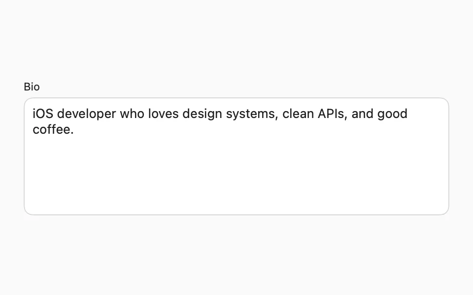
import SwiftUIstruct TextEditorUsageExample: View {    @State private var bio = "iOS developer who loves design systems, clean APIs, and good coffee."    var body: some View {        FLXFieldLabel("Bio") {            FLXTextEditor("Tell us about yourself", text: $bio)        }        .padding(FLXSpacing.xl)    }}

Installation

Requires the design system foundation (tokens and theme).

pnpm dlx shadcn@latest add https://swiftui.flexnative.com/r/mac-text-editor.json

Usage

FLXTextEditor("Description", text: $description)

The native TextEditor has no placeholder parameter, so FLXTextEditor renders the placeholder as an overlay.

On macOS, the border takes the theme's ring color while the field has focus, since the Mac doesn't draw its own focus ring around it.

Sizes

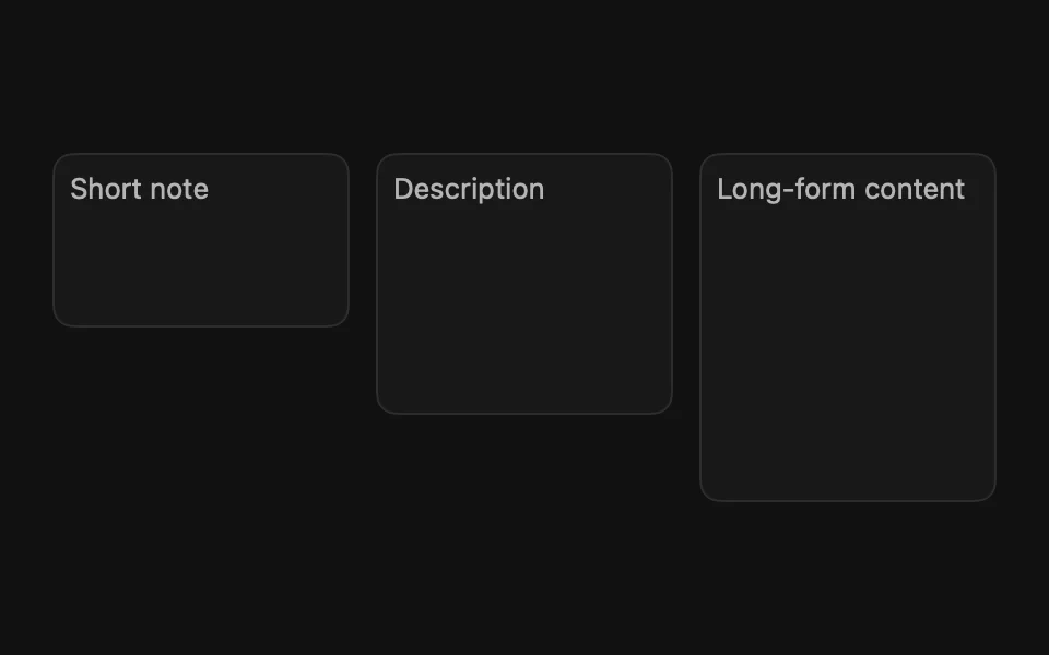
Three sizes, set via size:. Defaults to .medium.
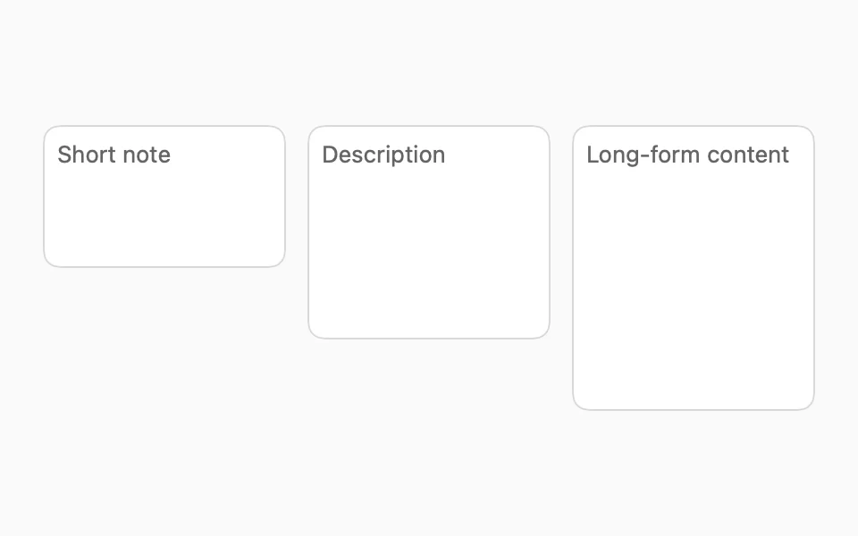
FLXTextEditor("Short note", text: $text, size: .small)FLXTextEditor("Description", text: $text, size: .medium)FLXTextEditor("Long-form content", text: $text, size: .large)

Custom styling

TextEditor has no style protocol, so there's no FLXTextEditorStyle or override.

API Reference

FLXTextEditor

init(    _ placeholderKey: LocalizedStringResource = "",    text: Binding<String>,    size: FLXTextEditorSize = .medium)init<S: StringProtocol>(    _ placeholder: S,    text: Binding<String>,    size: FLXTextEditorSize = .medium)

Sizes

CaseDescription
smallShortest fixed height (80pt).
mediumDefault fixed height (120pt).
largeTallest fixed height (160pt).

For more information about FLXTextEditor props, see the Apple documentation.