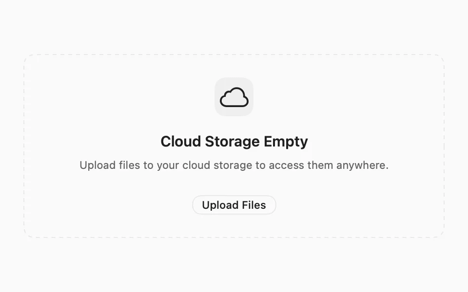
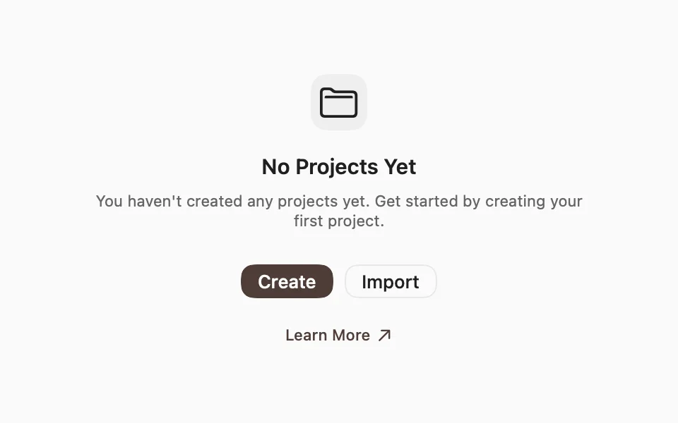
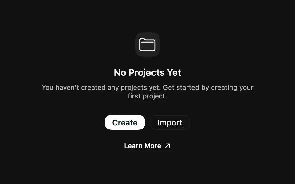
Displays an empty state, with an optional icon, title, description, and actions.
Installation
Requires the design system foundation (tokens and theme).
Usage
FLXEmpty fills the space it's given and centers its content, so it works as the whole screen or as an overlay on an empty list:
For search with no results on macOS 14 and later, SwiftUI's ContentUnavailableView.search already provides the system empty state.
Composition
Use the following composition to build an empty state:
All sections are optional. FLXEmptyHeader and FLXEmptyContent are centered VStacks with a readable maximum width. VoiceOver reads the header as one element, with the title as a heading, and skips the media.
Media
FLXEmptyMedia has two variants, set via variant:. .icon wraps an SF Symbol in a rounded muted square; .regular renders the content as-is, for an avatar or an image:


Custom styling
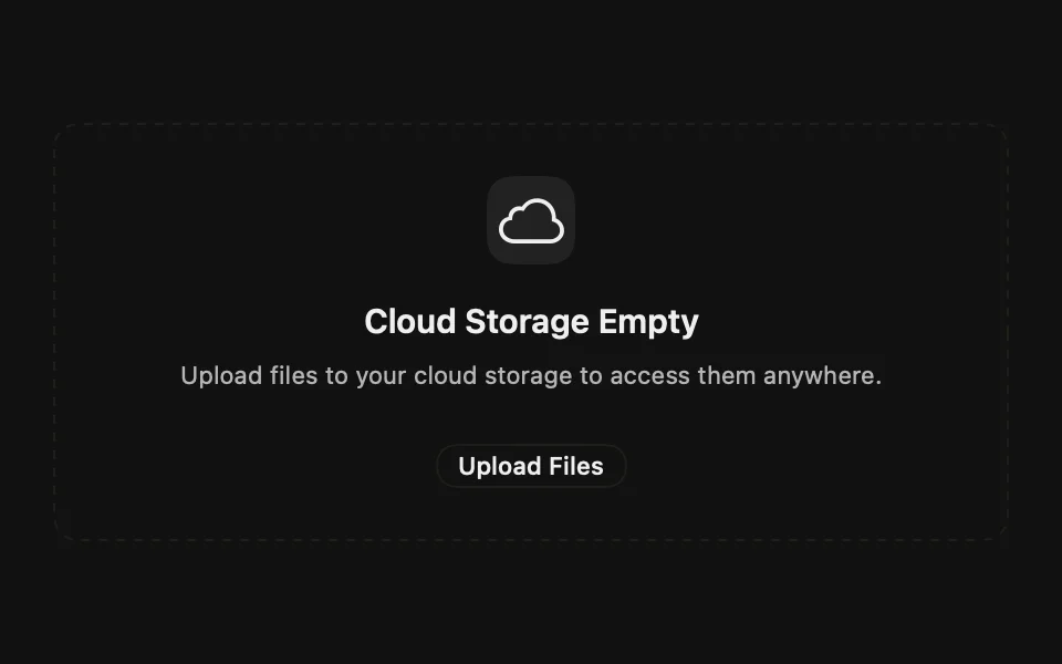
Each piece has its own FLX protocol: FLXEmptyStyle, FLXEmptyMediaStyle, FLXEmptyTitleStyle, and FLXEmptyDescriptionStyle. Override any of them for a subtree via the matching modifier, e.g. .flxEmptyStyle(_:) for a dashed outline: