Displays a control for selecting a value from a bounded range.

Installation
Requires the design system foundation (tokens and theme).
Usage
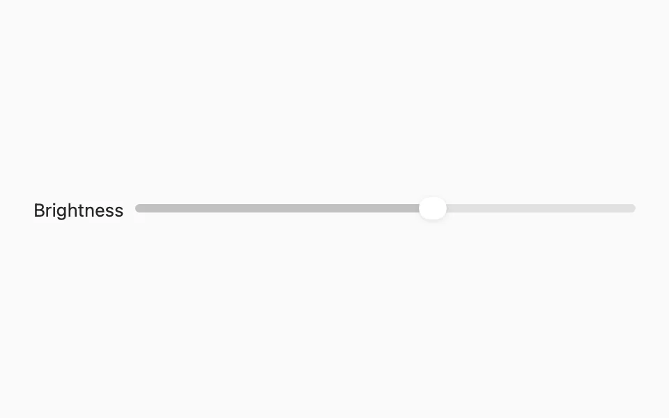
On macOS, the title is shown beside the slider, like SwiftUI's Slider on the Mac. Place it in a Form so the title gets the system's spacing and column alignment; outside a Form, SwiftUI draws the title right against the track. To show it above instead, pass an empty title and pair FLXSlider with FLXFieldLabel.
Range and step
Pass in: for custom bounds and step: to snap to increments. Defaults to 0...1 with no step.


Custom styling
SwiftUI's Slider has no style protocol, so there's no FLXSliderStyle or override. FLXSlider applies .tint(_:) with the theme's primary color. Track height, thumb shape, and range (two-thumb) sliders require a custom view.
API Reference
FLXSlider
For more information about FLXSlider props, see the Apple documentation.