Collapsible

macOS 13.3+

Displays content that can be expanded and collapsed.

import SwiftUIstruct CollapsibleUsageExample: View {    @State private var isExpanded = true    var body: some View {        FLXCollapsible("@peduarte starred 3 repositories", isExpanded: $isExpanded) {            VStack(alignment: .leading, spacing: FLXSpacing.sm) {                Text("@radix-ui/colors")                    .flxFont(.callout)                Text("@stitches/react")                    .flxFont(.callout)            }        }        .padding(FLXSpacing.xl)    }}

Installation

Requires the design system foundation (tokens and theme).

pnpm dlx shadcn@latest add https://swiftui.flexnative.com/r/mac-collapsible.json

Usage

FLXCollapsible("@peduarte starred 3 repositories") {    Text("@radix-ui/colors")}

Controlled vs. uncontrolled

Pass isExpanded to control the state, or omit it to let FLXCollapsible manage it.

FLXCollapsible("@peduarte starred 3 repositories", isExpanded: $isExpanded) {  Text("@radix-ui/colors")}

Custom styling

FLXCollapsibleStyle conforms to SwiftUI's native DisclosureGroupStyle. Override rendering for a subtree with any DisclosureGroupStyle via .flxCollapsibleStyle(_:):
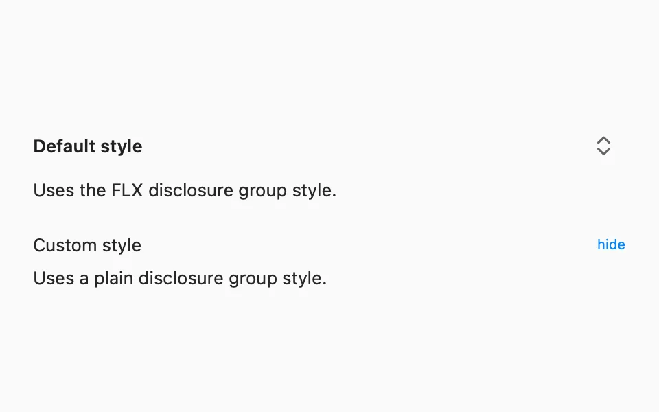
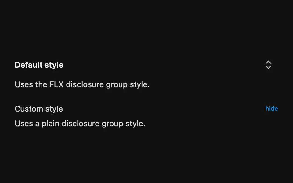
struct FLXPlainDisclosureGroupStyle: DisclosureGroupStyle {  func makeBody(configuration: Configuration) -> some View {      VStack(alignment: .leading, spacing: FLXSpacing.sm) {          Button {              withAnimation(.easeInOut(duration: 0.2)) {                  configuration.isExpanded.toggle()              }          } label: {              HStack {                  configuration.label                  Spacer()                  Text(configuration.isExpanded ? "hide" : "show")                      .font(.caption)                      .foregroundStyle(.blue)              }          }          .buttonStyle(.plain)          if configuration.isExpanded {              configuration.content          }      }  }}VStack(alignment: .leading, spacing: FLXSpacing.xl) {  FLXCollapsible("Default style", isExpanded: $isDefaultExpanded) {      Text("Uses the FLX disclosure group style.")  }  FLXCollapsible("Custom style", isExpanded: $isCustomExpanded) {      Text("Uses a plain disclosure group style.")  }  .flxCollapsibleStyle(FLXPlainDisclosureGroupStyle())}

API Reference

FLXCollapsible

init(    isExpanded: Binding<Bool>? = nil,    @ViewBuilder content: @escaping () -> Content,    @ViewBuilder label: @escaping () -> Label)init(    _ titleKey: LocalizedStringKey,    isExpanded: Binding<Bool>? = nil,    @ViewBuilder content: @escaping () -> Content)init(    _ titleResource: LocalizedStringResource,    isExpanded: Binding<Bool>? = nil,    @ViewBuilder content: @escaping () -> Content)init<S: StringProtocol>(    _ title: S,    isExpanded: Binding<Bool>? = nil,    @ViewBuilder content: @escaping () -> Content)

For more information about FLXCollapsible props, see the Apple documentation.